Behind the scenes | Payment button
Is it possible to get a payment gateway done on your website without any APIs, or without knowing any code? The answer is yes and the answer is a Razorpay payment button!
It is a simple 2 line code snippet that you stick to your web page to start collecting payments. As simple as it sounds, building it wasn’t so simple.
It all started with a difference of opinion, euphemistically put, around what the PM thought, what the management thought would really help the payment needs of anyone who wants to start collecting payments online on their blog, or site or event store.
First school of thought: What entrepreneurs and individuals want is a quick plug on their page or online profile to start making money NOW – we really need to push the payment page button to tell them what they can do – why aren’t we doing that?
The other school of thought: If someone wants it so badly, they are a few clicks away for getting it, what are we really changing – skipping a few screens at the most? We probably need to look at it ground up, instead of guessing something.
This went on and on, voices soared and finally we all had to agree on some basic premises –
- Overall, we want to distribute the product better i.e put the goods on the right shelves in the supermarket
- Stick to numbers – data doesn’t lie
So we ended up doing that diplomatic card trick, up every product team’s sleeve – do an A/B!
H(o): Significantly more no. of users, will adopt the payment page button if we make it more discoverable to screen B, instead of screen A
SCREEN B

SCREEN A

The experiment came out with colourful results, we saw more than a 100% uptick in the adoption of pages in screen B as compared to screen A!
That gave us the signal – now that we have the mandate, let’s put the goods on the shelves where the consumers really want it
And so we began..
Research phase
We decided to create this product ground up. This was the COVID baby Razorpay would be embarrassed of. Research of course begins with speaking to your merchants / customers.
Given Razorpay’s prominent spread across the country, it was really exciting to speak to a lot of college freelancers, independent entrepreneurs aiming for the sky and SMEs – providing a bunch of rich insights.
In summary, this came out clearly-
- Entrepreneurs, with a higher risk profile, want to validate their ideas immediately – payments need to happen NOW
- It is more prudent to fail with a low cost setup rather than full blown tech. Infra
- If you’re running low on resources, it is a no-brainer to go for an off-the-shelf payments solution, but many get lost in the shopping process and possibly choose something that doesn’t fit
Did we sense a gap to fill ? Yes.
Are we in the right place to fill it ? Yes.
Do we know how to do it? We’ll figure out!
Brainstorming phase
Enter the grind here. Sticking to the basics, the first thing you close is your PRD.
Customer needs, problem statement, approaches considered, the solution, competitor research, the priority of items, a future wish list and of course – the metrics.. and your recipe is ready. This process is very much like playing a game of Pac-man – eating all pellets in a maze.
We had two overarching questions we had to answer –
- Typically we have had a WYSIWYG approach to Razorpay payment pages, how do we maintain the essence of that approach even if your product necessarily does not merit that approach?
- We want a copy paste solution that does not take away the context from the website, where the consumer and retain the ability to collect customer information.
This led to a lot of back and forth especially the design team burning the midnight oil – trying out a variety of approaches to ultimately make the experience as simple as possible.
“We aren’t building our product fantasy here” “Our competitors do it doesn’t mean they do it right” “Are offering a set of BOSCH tools to our merchants? NO.” – that’s how brainstorming sessions work. A lot of virtual fists, heady arguments and a reasonable consensus.
What really matters in this phase is that you become clear in what you define your MVP as, what are the customer needs you wish to solve in the MVP and most importantly what is it that you DON’T want to solve in the MVP. The smaller decisions that were grey earlier, now stand out as black and white.
There’s no better way to arrive at this but to have multiple minds slug it out in a ring zoom call, and of course with a deadline as the hanging axe.
Build and conquer
We were re-inventing the wheel in terms of building a payment button but to do one for our audience persona, and for the problems we felt are genuine still makes you think from first principles. Many have scored a century before but scoring one is no easy task!
The solution to reiterate needs to do this –
- No-coding solution that sits on any webpage
- Retains the payment context without any redirections
- Seamlessly provide all the awesome features that Razorpay checkout provides
- Offer the additional functionality to collect customer information or have multiple amount fields within this solution
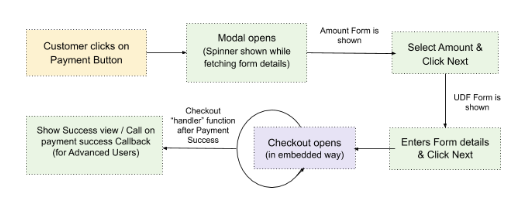
The payment journey looks like this –

What were the decisions on the table?
- Do we go for an iframe+iframe approach where we sort of box the button?
- Form tag with an option of a few preferential parameters
We chose a form tag but what is more important is how you get there. The factors that help you make this decision are –
- How does it for the future roadmap?
- Are we compromising on simplicity for the customer?
- Does this code let the button stay as a button on the customer’s web page and not take up additional space?
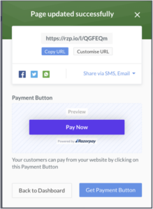
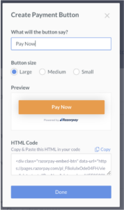
This is how the button looks –

The sample code is –
<form>
  <script
    src="https://cdn.razorpay.com/static/widget/payment-button.js"
    data-payment_button_id="pl_FFXCKskE5f4WLA"
    data-button_text="Pay Now"
    data-button_theme="rzp-dark-standard"
  ></script>
</form>
The final solution was to solve through 2 scripts – a Main controller script and a frame controller script. The main script is what our customer will add to their webpage which will in turn instantiate the frame controller script. The frame controller is where most of the action happens.
From here on, it is a race to the finish line – which meant regular stand-ups, a healthy mix of escalations and some (or many) late nights. This is when the team feels what teamwork is. As the builds are pushed and bugs are squashed, you need to take the time to align other stakeholders right – the management, support and operations.
This culminates in the best part when you get that chance to push the final launch button, you know, the one below

SEEK AND DEPLOY!
It is not over yet, you have your goods ready but the difficult task of getting it on the right internet shelves will follow, and more so, the toughest task of making the shopper want to buy your good when they see it on the shelf, still remains!
Learn how merchants are using it here