An alternate approach to UPI Onboarding
At Razorpay, we are big fans of UPI. While most of us have been using BHIM UPI Apps for a while now, I happily take up every opportunity to educate that one more person who’s yet to make their first QR payment. Moreover, as a digital payment enabler ourselves, every one of us is always exploring means to reduce friction in the user’s payment journey. It was during the course of recent interactions that I realized BHIM UPI onboarding could be further simplified.
While helping Elumalai get started with collecting UPI payments, I navigated him through each step and realized two steps proved to be cumbersome — selecting Bank and entering Debit card details. Could the NPCI use the combination of verified mobile number and scanned card details to onboard a user more easily, and swiftly?
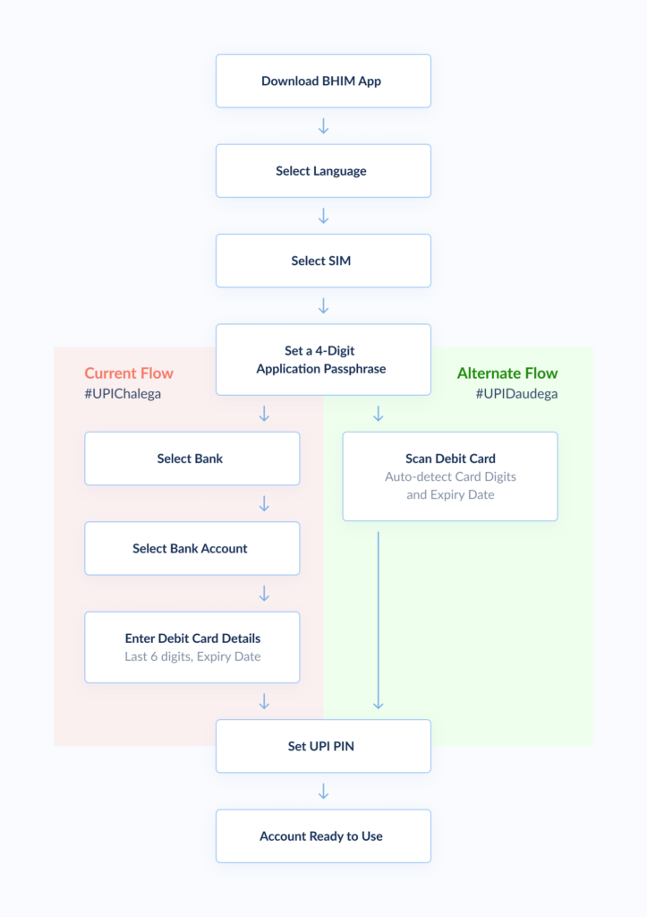
Consider the current onboarding flow for NPCI’s BHIM UPI App, with the alternate onboarding flow on the right:

The alternate flow takes advantage of the fact that the first six card digits are sufficient to identify the Bank Name. The user’s mobile number can be used to identify the mapped Account Numbers. Further, since most users are likely to have only one account per bank, the retrieved Account Number is not even displayed and the user is taken to the Set UPI PIN screen directly. In the event that the user has multiple accounts in the same bank, after scanning the card an intermediate step (not shown above) would require the user to select the appropriate Bank Account Number, and then proceed to the Set UPI PIN screen.
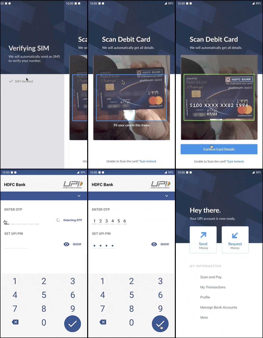
Here’s a mock visual of the proposed flow in action:

The current manual card entry flow can co-exist for users that do not have an operational camera to scan the card.
The NPCI team is probably iterating on the next release of its game-changing solution. If they aren’t planning on introducing an even simpler onboarding flow, this change might be worth exploring.
Credits: Saurabh Soni, Nemo