
If there’s something every Indian e-commerce shopper hates, it is complications at the final step of the purchase. A great user experience at the checkout stage is a problem that many payment players in the industry have been trying to solve, for a very long time.
Why you ask? Because the checkout is the final confirmation of your customer’s intent. We know that CoD orders have a high chance of being cancelled. The aim for every e-commerce business should then be to nudge their customer towards making an online payment.
Sales, offers, cash-backs – these are some ways of ensuring an online payment. A good checkout design, however, is still paramount.
But it’s not easy designing checkouts for the Indian e-commerce universe!
This is because of the unique characteristics of the Indian payments space. Hundreds of payment methods, various modes of authentication, the involvement of multiple entities, elaborate policies and regulations, users who are new to online shopping and are still discovering its nuances; and to top it all, slow internet speeds!
Jokes aside, the Indian payments industry is as challenging as the Apollo mission was. E-wallets, for instance, are more than a decade old, and at last count, there were about 80 e-wallets in the country. Compare this to our next-door neighbour China where the wallet industry is primarily binary (AliPay and WeChat), and you get the difference!

But here’s the fact of the matter, as I see it. Digital payments are complex, yes. But, they should be complex for payment providers like us; Razorpay, and not for the end users. For someone looking to order their nightly grub, an online transaction should be as simple as wiping out the universe in the blink of an eye.
At Razorpay, it has been the joy and pride of my team of designers and I, to work on simplifying the user journey from desire to purchase. This is what our hard work, and design genius, has achieved.
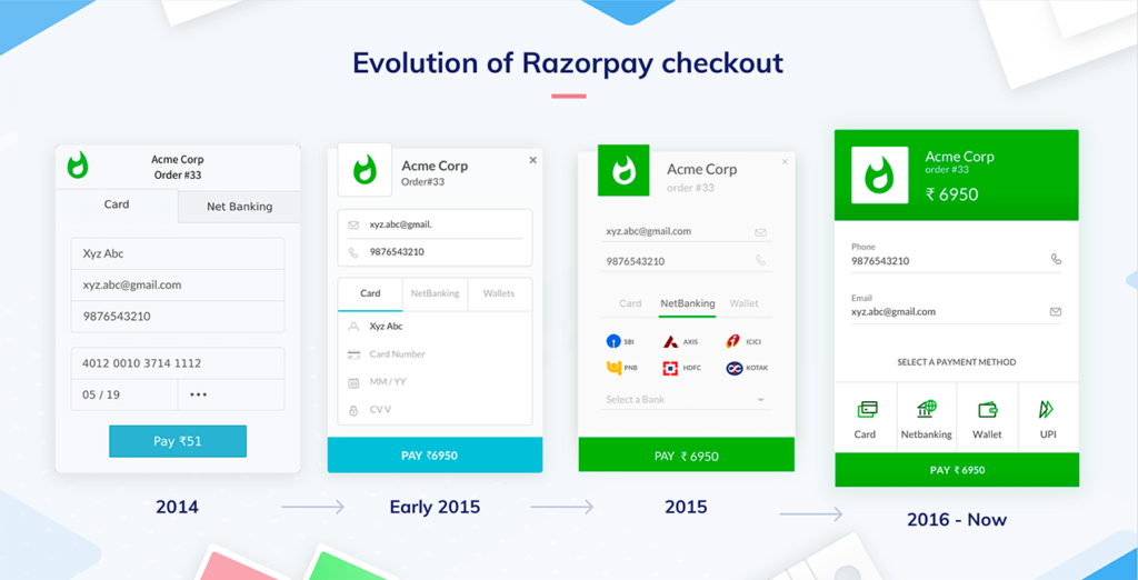
Razorpay Checkout: The Evolution of Simplified Online Payments
Razorpay Checkout is the magical form which converts your money into a late night dessert fix. Also, the form which helps you pay for that Ginger Chai on Chai Point, within 30 seconds. In essence, the checkout is a single line of Javascript code in the clients’ website or app that has been simplifying payments for well over the last three years.
In its first avatar, the form offered support for Card, NetBanking and Wallets, but did not have an option for EMI, or to save cards.
Its USP: it would open up on the merchant’s native website, without redirecting to another page. This lowered payment failure rates by removing one hop in the process, and saved precious moments during checkout – and we all know how even a split-second delay can change a user’s mind.
The ‘Retry’ button on our checkout was also aimed at reducing drop-offs. Unlike other payment gateways at that time, the Razorpay gateway did not erase the data entered during checkout, and customers could retry a failed transaction with just the press of a button instead of re-entering every piece of information.
This version quickly got old, though. And we went on to create newer versions with updated UI elements and the latest online payment modes.
So, what’s special about this?
Glad you asked! A checkout form looks really easy to design, but the devil – as always – lies in the details. Allow me to take you through a user’s payment journey in detail, and explain how the Razorpay checkout makes every step easy for the customer.
Step 1: The checkout form opens.
Think of this scenario. You’re on Chai Point. Everything is their dark green colour. Suddenly, you see a blue-coloured Razorpay checkout while paying. Odd, right?
A customer picks their favourite products from an e-commerce website and is then directed to a new site for payment. This redirection on the checkout page creates confusion, lowers the customer’s trust, and leads to drop-offs. The solution: a checkout form that opens natively on the website.
What if the checkout form looks closer to Chai Point’s actual website? What if the design makes the user feel that the payment process is part of the website they are buying from?
That’s exactly what the colour logic we devised in-house does. It takes the merchant’s colours, adds them to the checkout form, and makes sure everything looks and feels like one cohesive information flow. Since our form uses iFrame, it opens up within the website the user is on; without any redirects.

Step 2: Filling your payment details on our checkout form.
The first rule of good checkout design is: No One Likes to Fill Endless Details! And Razorpay’s intuitive checkout design handles multiple user touch points without ever making the experience feel overwhelming.
So, while the user has a plethora of payment options to choose from, each of these options has its own UX tweaks to make the experience better. Let me explain these in detail here.
Cards: Making a payment online via cards is simple, right? You fill in the card information, authenticate using an OTP or password and money is out of your pockets, right?
Well, it sounds simple but when it comes to the experience, we have done a lot to make it much simpler than it usually is:
- We make the input fields auto-focus right after you’re done filling in the previous field. Seems obvious and trivial but this little tweak, when overlooked, creates a lot of annoyance.
- Maestro cards with no CVV? No worries! A card with an option to authenticate via the ATM PIN? Bring ‘em. Every edge case is meticulously handled by our intuitive design so that the pain points for every user is minimized.
- We’ve come up with a Flash Checkout feature to help customers save their card details on Razorpay. This has reduced the total time for every transaction by as much as 60%. The best part, you save your cards once on Razorpay and enjoy this feature across all of our 80k+ merchant base. The data is encrypted and kept safe, but it does help lessen transaction times.
- Features like OTP auto-fill allow us to reduce the transaction times even further. We hate waiting for those OTP messages too 😅 So, we auto read them and make the user’s life even easier.
Power Wallets: When a user makes a transaction via a wallet, the normal payment flow takes them to the wallet or app’s page, where they enter their OTP/login authentication to complete the transaction. To shorten the transaction time and lower drop-offs, we’ve teamed up with wallets like Mobikwik, OLA Money and Freecharge to come up with ‘Power Wallet’, a hassle-free no-redirection payment flow for wallets.
UPI: As a new player in the market, there was a huge confusion regarding UPI among the users. But not with Razorpay! Our intent solution to UPI is so straightforward that the users don’t need to remember their UPI ID at all. Just one click on your favourite UPI app and you are one step closer to completing your payment.
Related Read: What is UPI ID & How to Create UPI ID?
Curious how do we do this? You can read more on UPI intent and how we leverage it in our design. Also, before I forget, we were the first in the industry to help users with UPI and it’s complexities 😉 *not bragging at all*
Step 3: Complete the payment. Get your ginger chai!
What’s next?
Digital design is like painting, except the paint never dries, said Neville Brody.
Designing a checkout form feels like wet paint at times, because of the ever-changing landscape of the Indian payments industry.
But in this lies the fun; for the need to redesign an already perfect design can be a great teacher. What I have learnt over the years doing this very thing calls for a blog of its own!
The constant, though, has been this – that as more customers connect to the online world than ever, they are increasingly spoilt for choice and expect quality personalized experiences from the fintech industry.
The best way to keep track of your audience’s wants is to look into your consumer data and find trends and patterns that help you determine intent and expectations. And use these insights to create UX design awesomeness!
At Razorpay, we do this every day.
Not only are we aware of the latest trends in B2B design, and the new payment modes to add to our checkout; we also always leverage data to design for our end customers’ specific needs, and solve industry pain points.
And this, at the end of the day is what good UX design does, – it solves, informs, captivates, and allows users to buy into your brand (or in this case, buy from your brand 😛).

Inspired by what you read? Interested in solving payment problems with design? We’re hiring designers across levels! Shoot a mail to hiring.design@razorpay.com

