

Available in🇮🇳 India
You can compare the probability of risk associated with orders reviewed via COD Intelligence or manual review. View the graphs for a selected period up to the last 90 days.
Widgets
The following widgets are available in the Risk Report tab of the RTO Analytics Dashboard. Check which widgets are applicable when you opt either for:- COD Intelligence.
- Manual review of COD Orders.
Safe vs Risky Users
The following widget is available only if you opt for COD Intelligence in the Settings section. This graph shows the split between safe and risky users for the total users processed by Magic Intelligence. You can filter data to display it on a Daily, Weekly or Monthly basis. Hover over the graph for a breakdown of the data and the total number of users.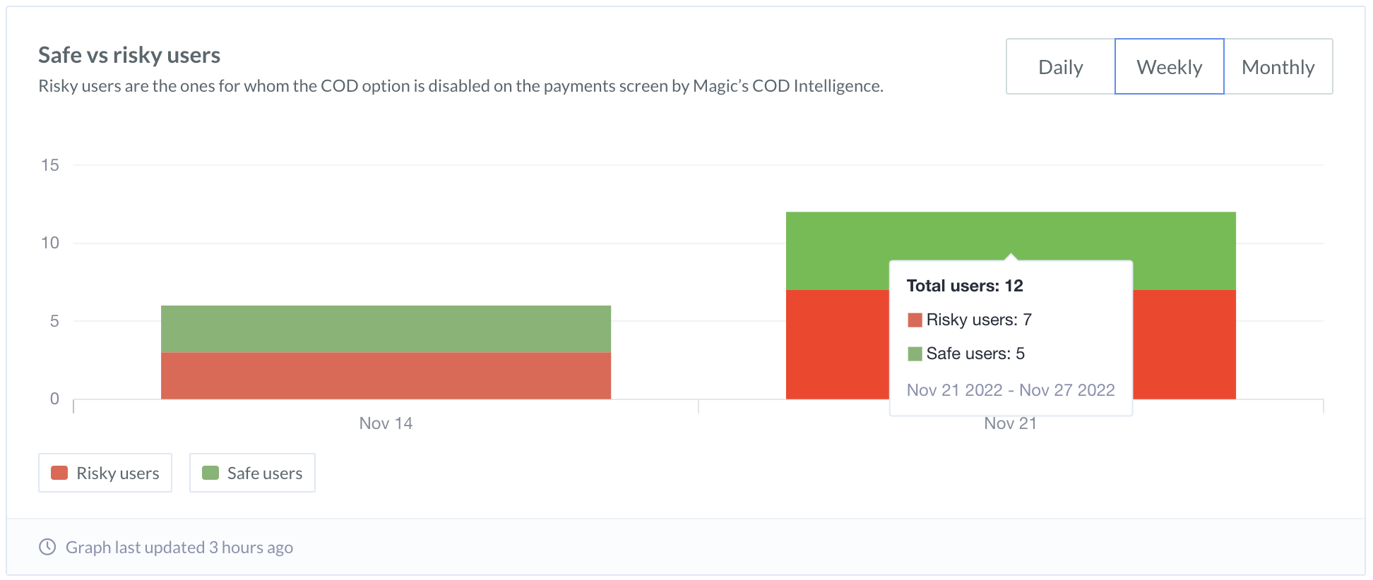
RTO Risk Distribution
The following chart provides insights only when you opt for Manual review of COD orders in the Settings section. The RTO risk distribution bar graph provides a time-wise break-up of the orders’ riskiness. You can view the graph Daily, Weekly or Monthly.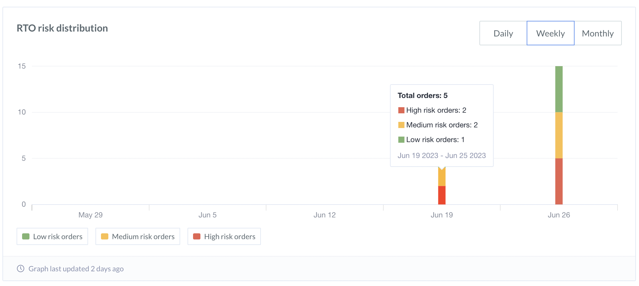
Handy TipsAutomate your manual review process or let COD Intelligence handle your COD Orders. Know more about the RTO Analytics Dashboard for COD Intelligence.
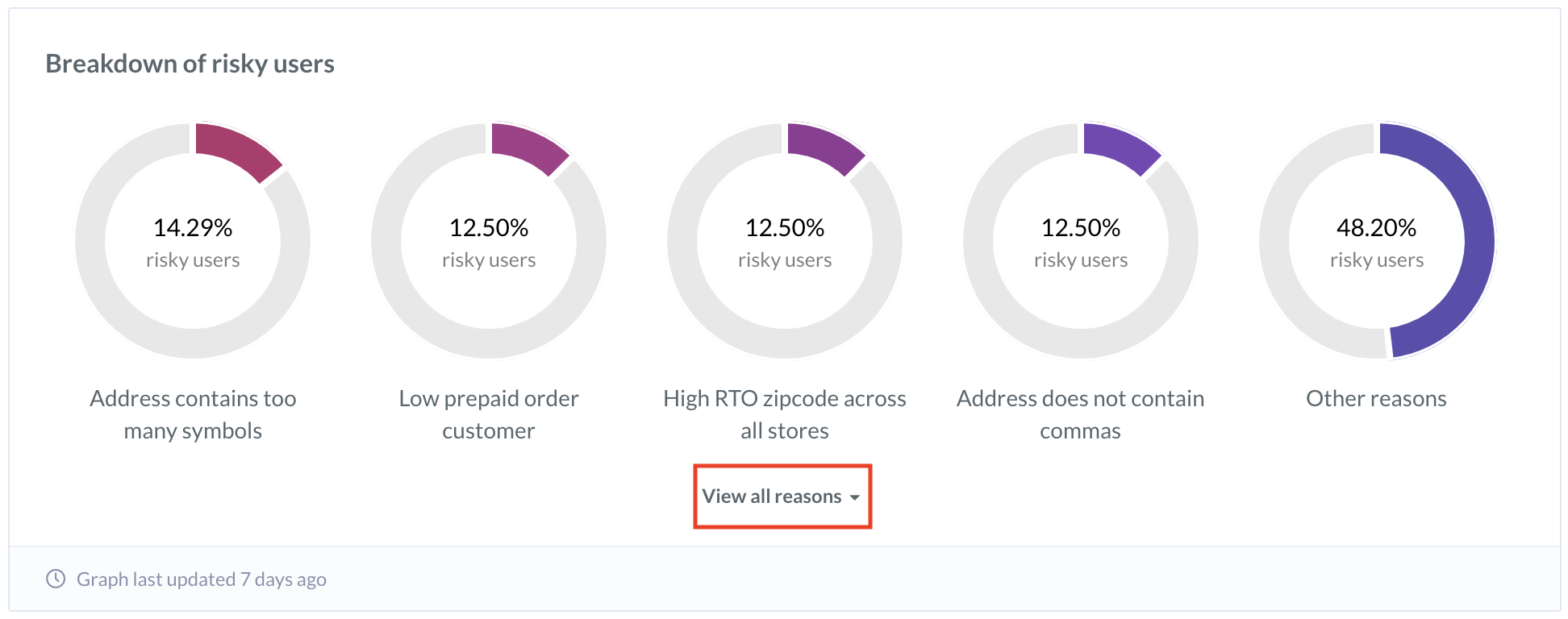
Breakdown of Risky Users
The following widget is commonly available whether you opt for COD Intelligence or Manual review of COD Orders in the Settings section. This tab shows why the users are flagged as risky. The top reasons are displayed first, and the rest are listed under different categories. The intelligence flags the users as risky because:- The address contains many symbols, gibberish, or does not contain commas.
- The user has a lower number of prepaid orders.
- The user or zip code has a high RTO percentage across many stores.
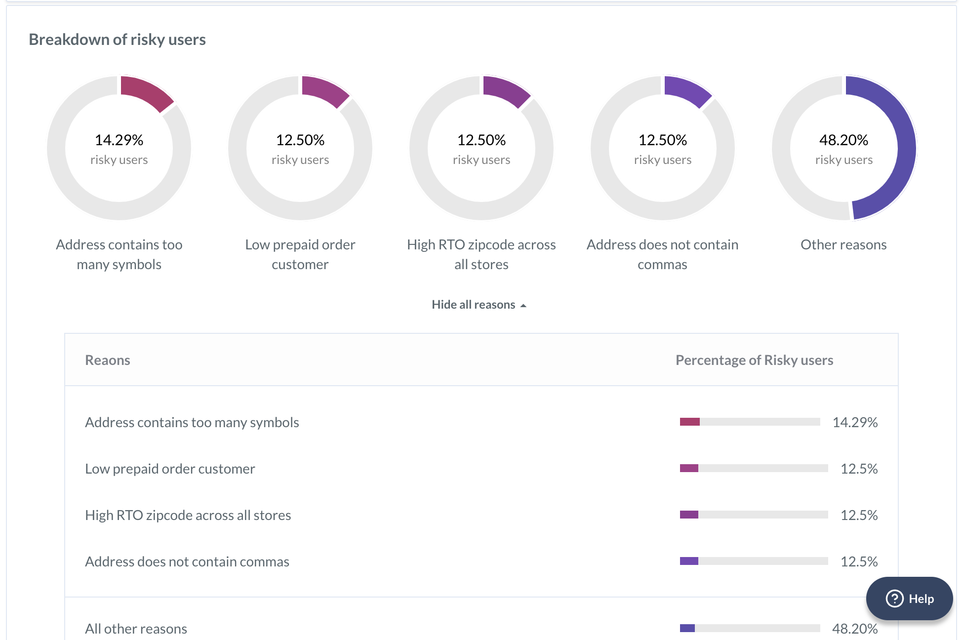 To view all the remaining reasons, click View all reasons.
Incremental Prepaid Orders Gained
The following widget is available only when you opt for COD Intelligence in the Settings section. This chart shows the split between the Regular orders and the Additional prepaid orders received because of RTO intelligence. You can analyse how many potentially risky orders were converted to prepaid because of RTO intelligence.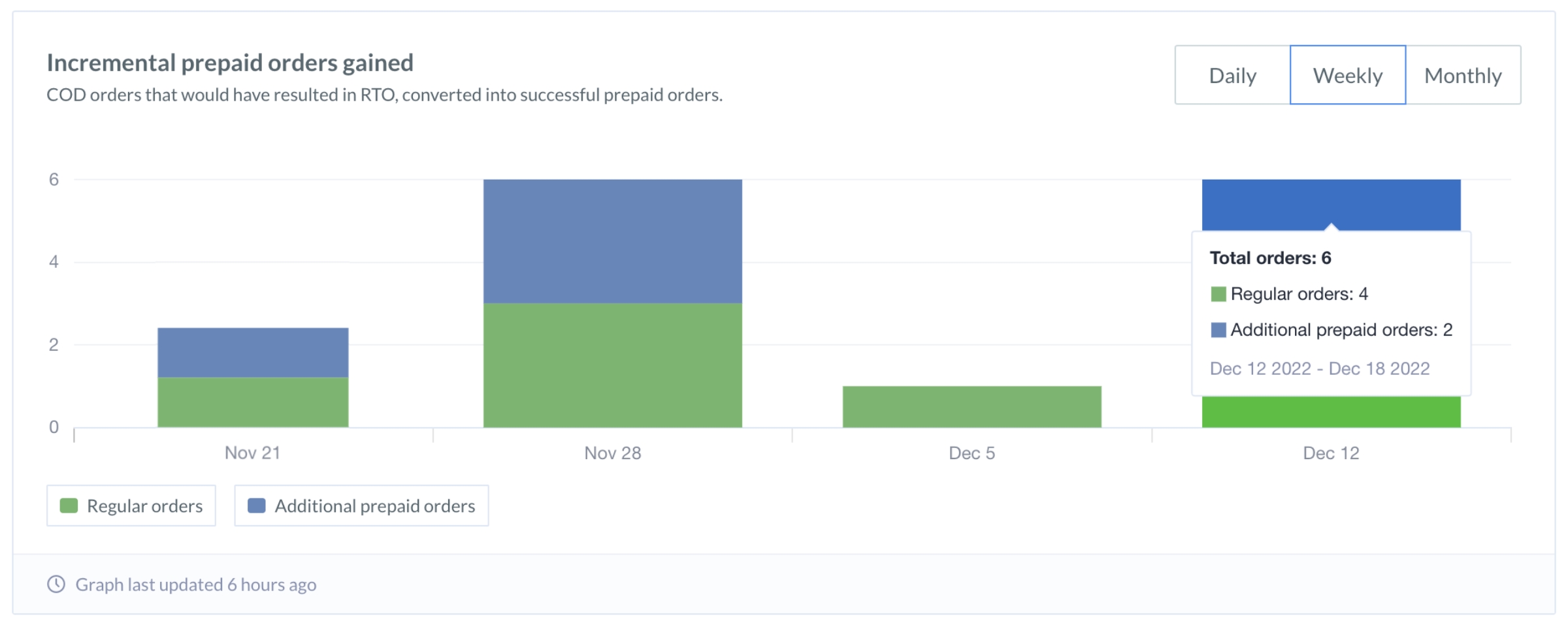 You can filter data to display it on a Daily, Weekly or Monthly basis. Hover over the graph for a breakdown of the data and the total number of orders.