Order confirmation emails are crucial touch points in the customer journey, informing buyers that their order has been received and is being processed. This article explores their importance, key elements, and how to craft effective templates that inform buyers and build brand loyalty. We’ll dive into real-world examples and provide actionable tips to elevate your post-purchase communication.
Table of Contents
What is an Order Confirmation Email?
An order confirmation email is a digital receipt sent to customers after a purchase. It confirms that the order has been received and is being processed, provides essential details about the purchase—such as items, costs, and shipping information—and sets expectations for the next steps, including processing time and shipping updates.
These emails validate the legitimacy of the business, ensuring customers that their order and shipping details are accurate and that their purchase was legitimate. When done effectively, they can reinforce the customer’s buying decision, build trust, and even pave the way for future sales.
Key Elements of an Effective Order Confirmation Email
An effective order confirmation email includes key elements that ensure clarity and enhance customer satisfaction. These components not only confirm the order but also provide essential details to manage expectations and build trust. Here are the crucial elements to include:
1. Clear subject line
Start with a clear subject line that includes the order number and a phrase like “Order Confirmed.”
2. Personalisation
Address your customer by their name to create a more personalized experience.
3. Order summary
List the items purchased, quantities, and total prices to remind customers of their order details.
4. Payment confirmation
Confirm the payment method used and the total amount charged.
5. Shipping details and estimated delivery date
Provide the shipping address, method, and estimated delivery date for transparency.
6. Contact information for customer support
Include a phone number or email address for customer support if they have questions.
7. Thank you message
Express gratitude for the purchase to build goodwill and encourage repeat business.
8. Additional recommendations or related products
Suggest similar or complementary products to drive future sales.
Order Confirmation Email Best Practices
1. Timeliness
Send the order confirmation email immediately after the purchase to reassure customers that their order is being processed.
2. Clarity
Use simple language to make the email easy to understand, avoiding jargon and unnecessary complexity.
3. Visual Appeal
Incorporate your brand’s colours and logo, and maintain a clean layout to ensure the email looks professional and aligns with your brand identity.
4. Mobile-Friendliness
Optimise the email for mobile devices to provide a seamless experience across all platforms.
5. Personalisation
Customise the email content, such as greeting customers by name and recommending products based on their purchase history.
6. Clear Call-to-Action
Include a clear call-to-action, like a link to track the order or visit your online store, to guide customers on what to do next.
7. Legal Compliance
Include essential legal information, such as terms of service and return policy, to ensure compliance and provide transparency.
10+ Order Confirmation Email Examples
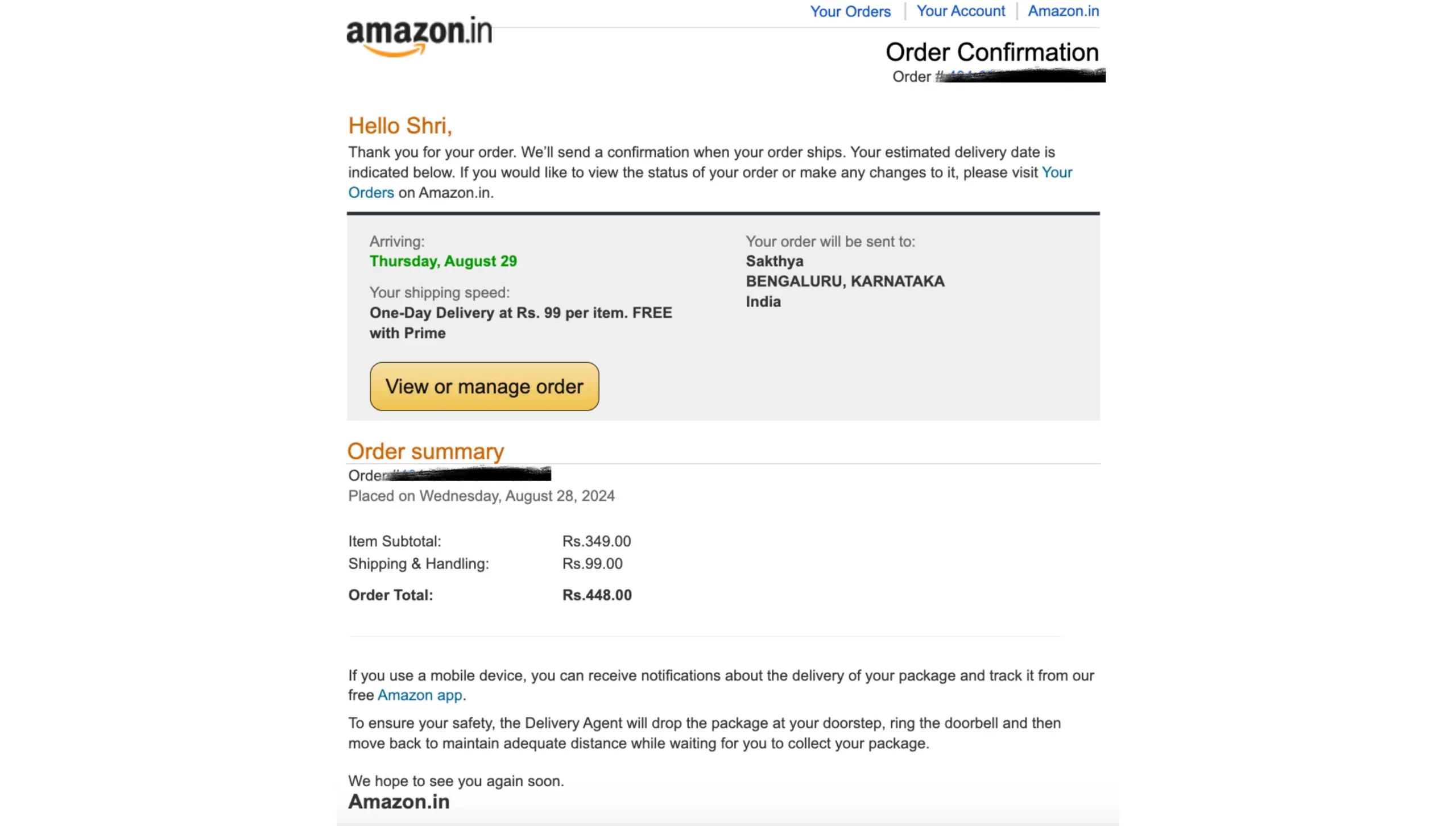
Example 1: Highlight the Next Steps (Amazon)
Amazon’s order confirmation emails are simple yet effective, featuring a clear summary of the purchase and a prominent “Track your package” CTA. The design is minimalistic, focusing on functionality.
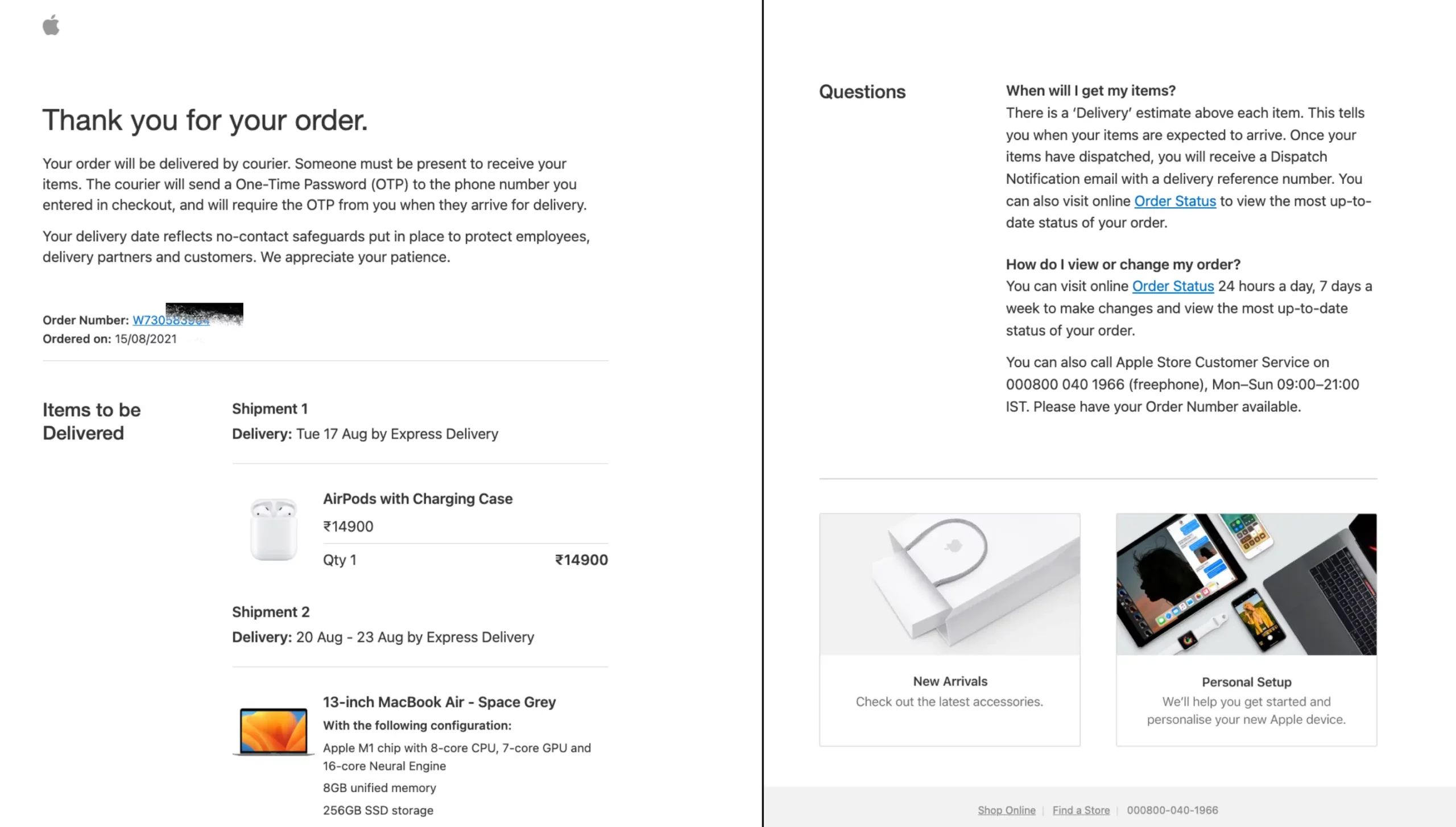
Example 2: Offer Easy Navigation (Apple)
Apple’s confirmation emails are sleek and visually appealing, featuring a clean layout with essential details like the order summary and expected delivery date. The email also provides options to view or manage the order.
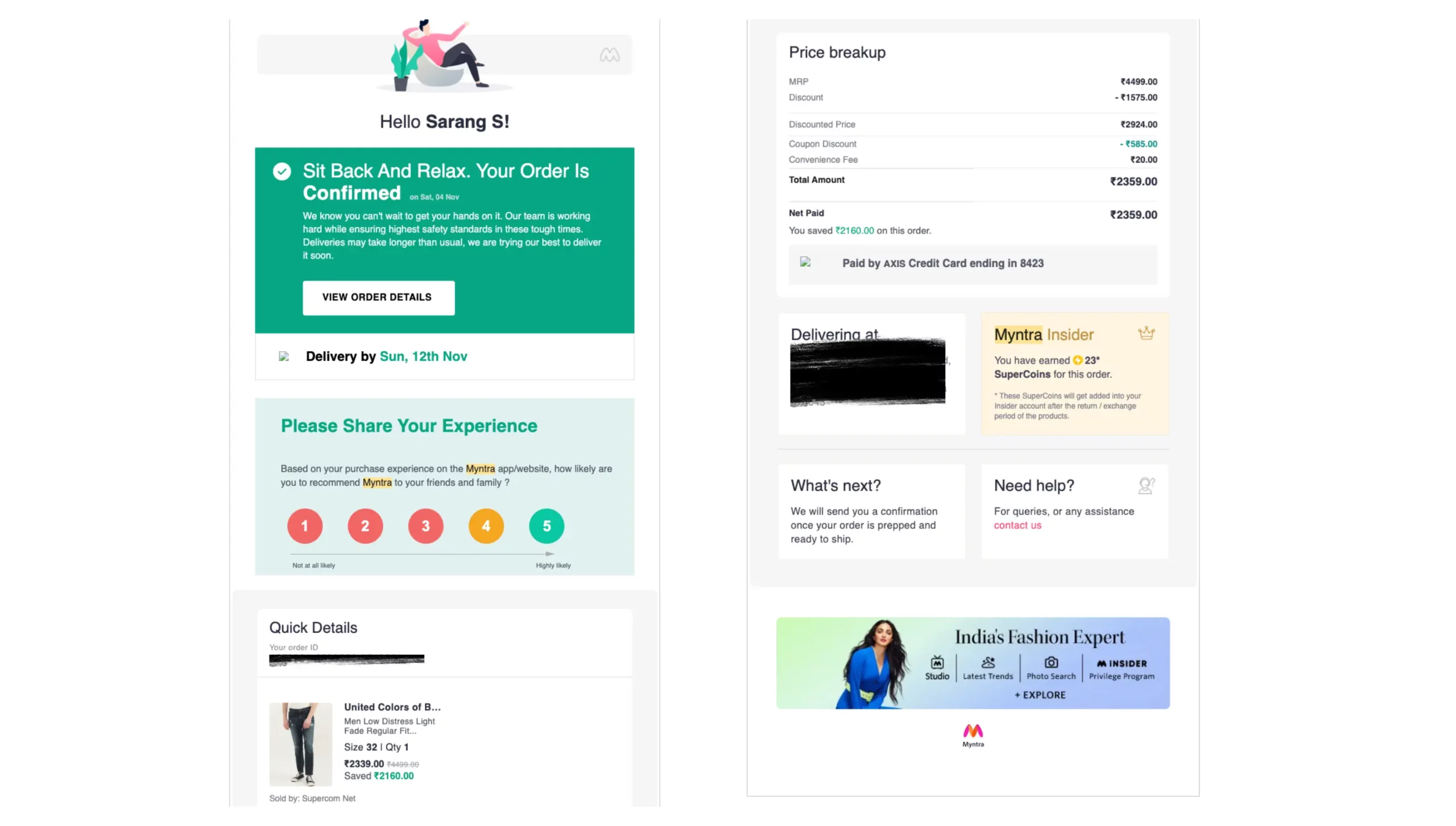
Example 3: Encourage Product Discovery (Myntra)
Myntra’s order confirmation emails are vibrant and fashion-forward, featuring a clear summary of the purchased items. Along with the confirmation, the email suggests similar products or new arrivals based on the customer’s preferences, encouraging further shopping.
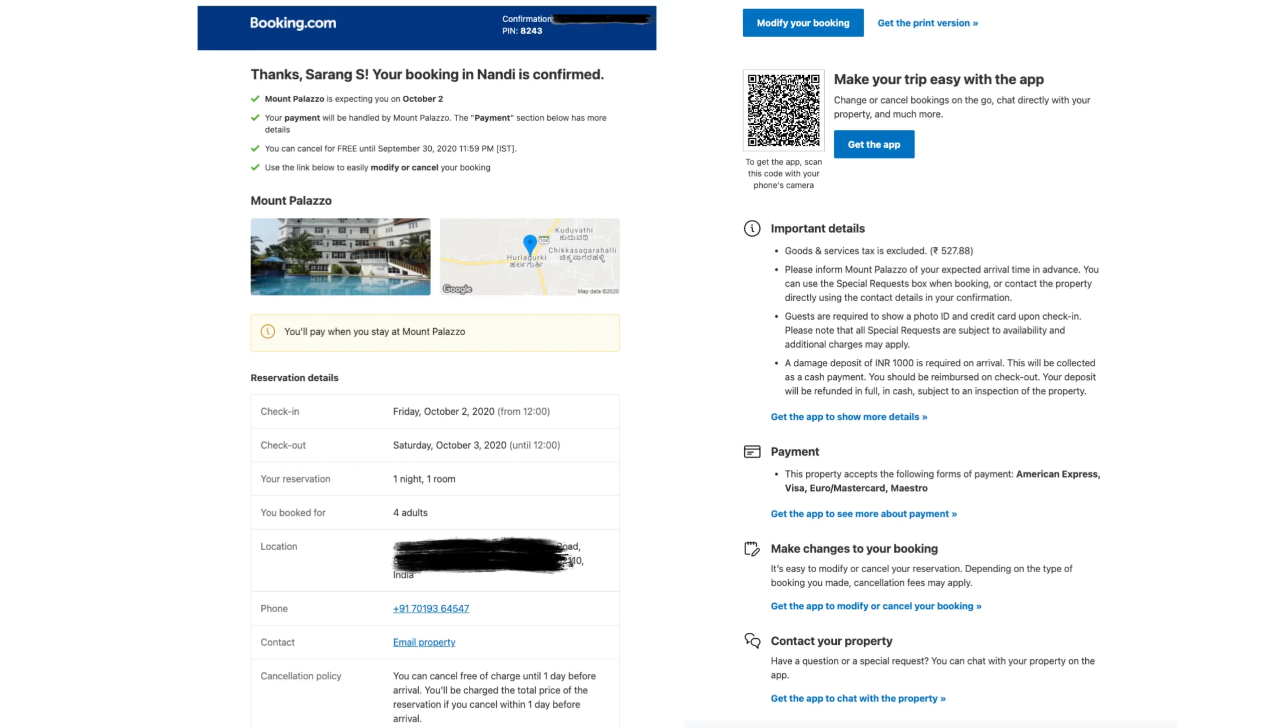
Example 4: Provide Comprehensive Information (Booking.com)
Booking.com’s emails include comprehensive booking details, such as check-in instructions, accommodation amenities, and local area information. They often feature a “Manage booking” CTA for easy modifications.
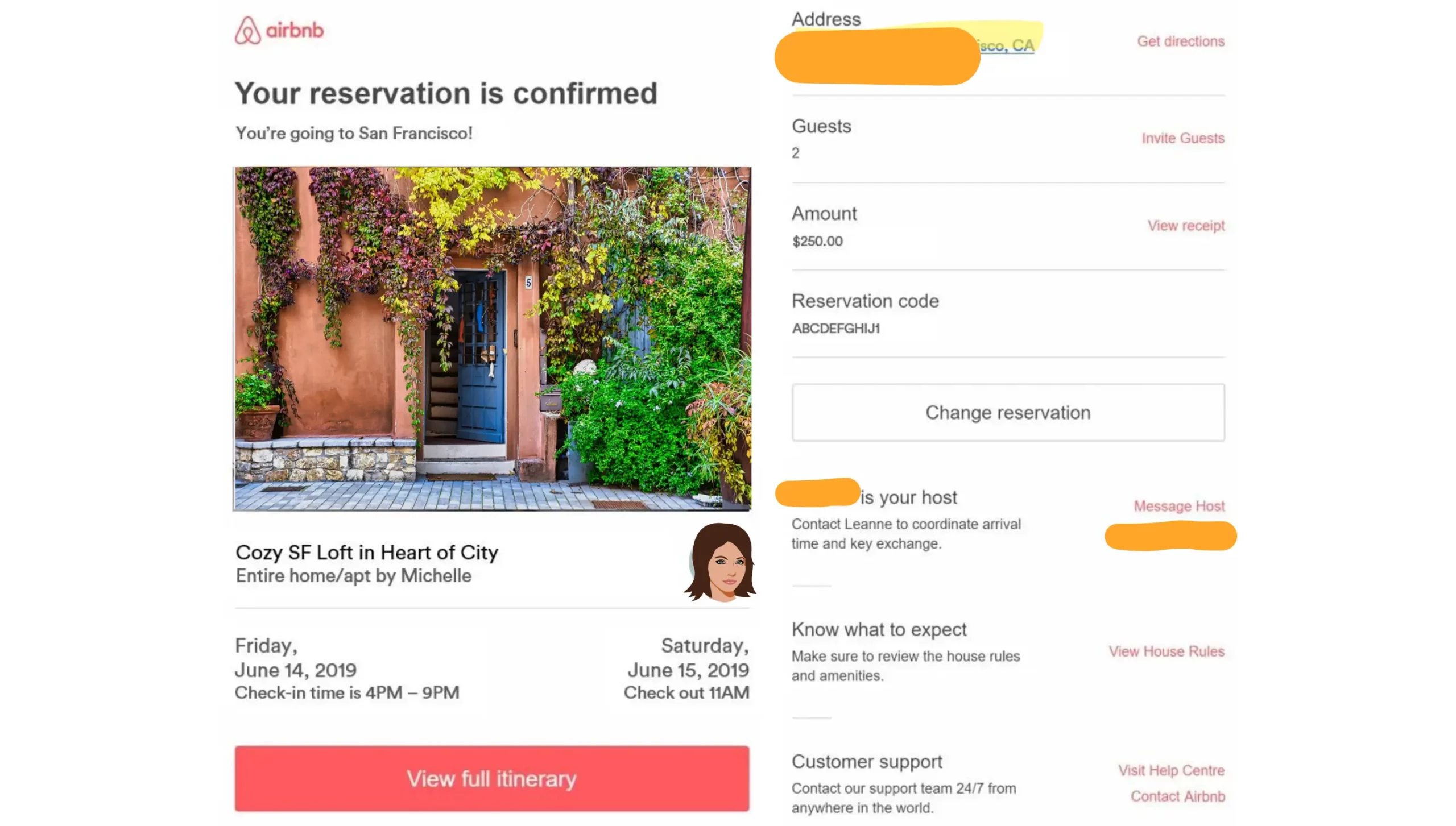
Example 5: Reinforce Brand Values (Airbnb)
Airbnb’s emails are warm and welcoming, often starting with a personalised greeting and highlighting unique aspects of the booked experience. The email includes detailed information about the stay and local recommendations.
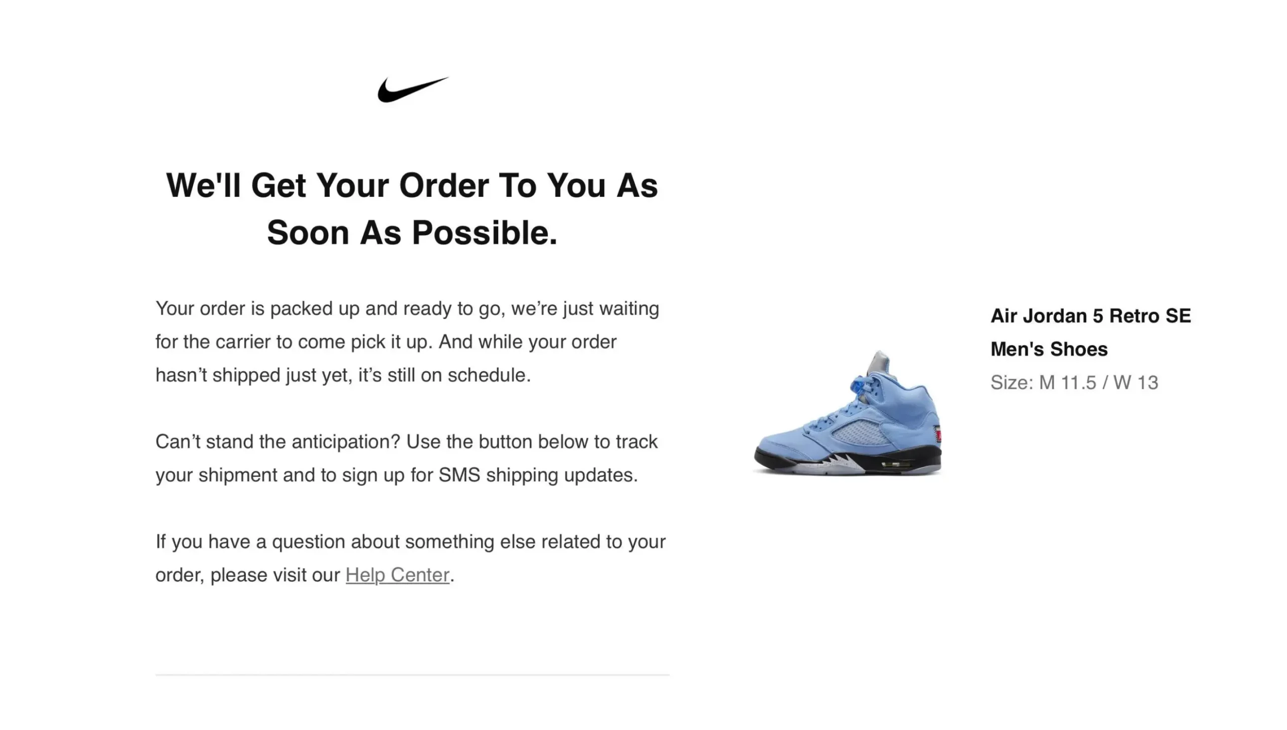
Example 6: Emphasise Customer Benefits (Nike)
Nike’s order confirmation emails focus on the benefits of the purchase, such as “Free returns” and “Member rewards.” The email design is bold, with a strong use of brand colours and imagery.
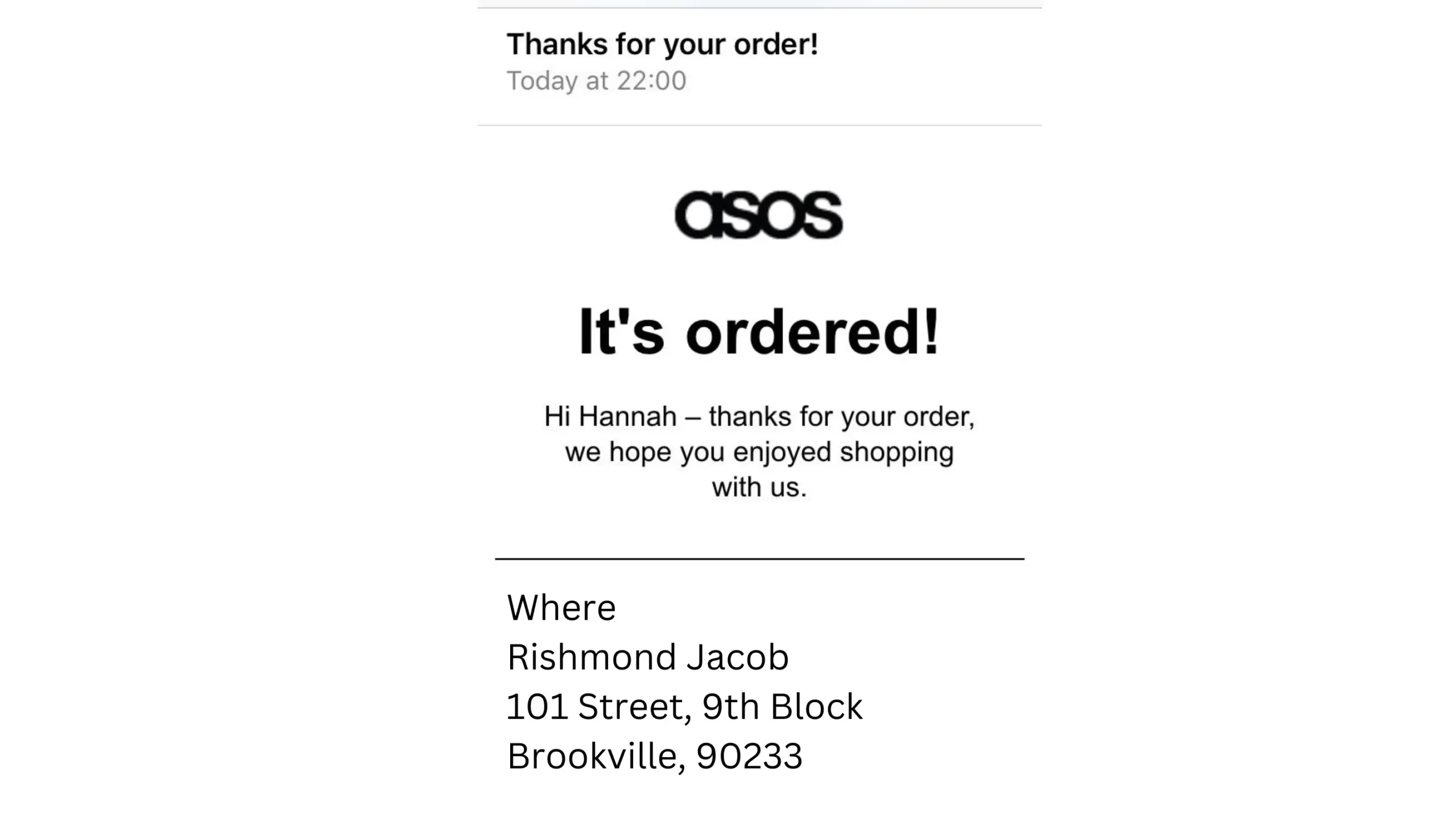
Example 7: Encourage Further Exploration (ASOS)
ASOS’s order confirmation email features a simple “Thank You” message and highlights related products. The clear layout and visuals encourage customers to explore more offerings.
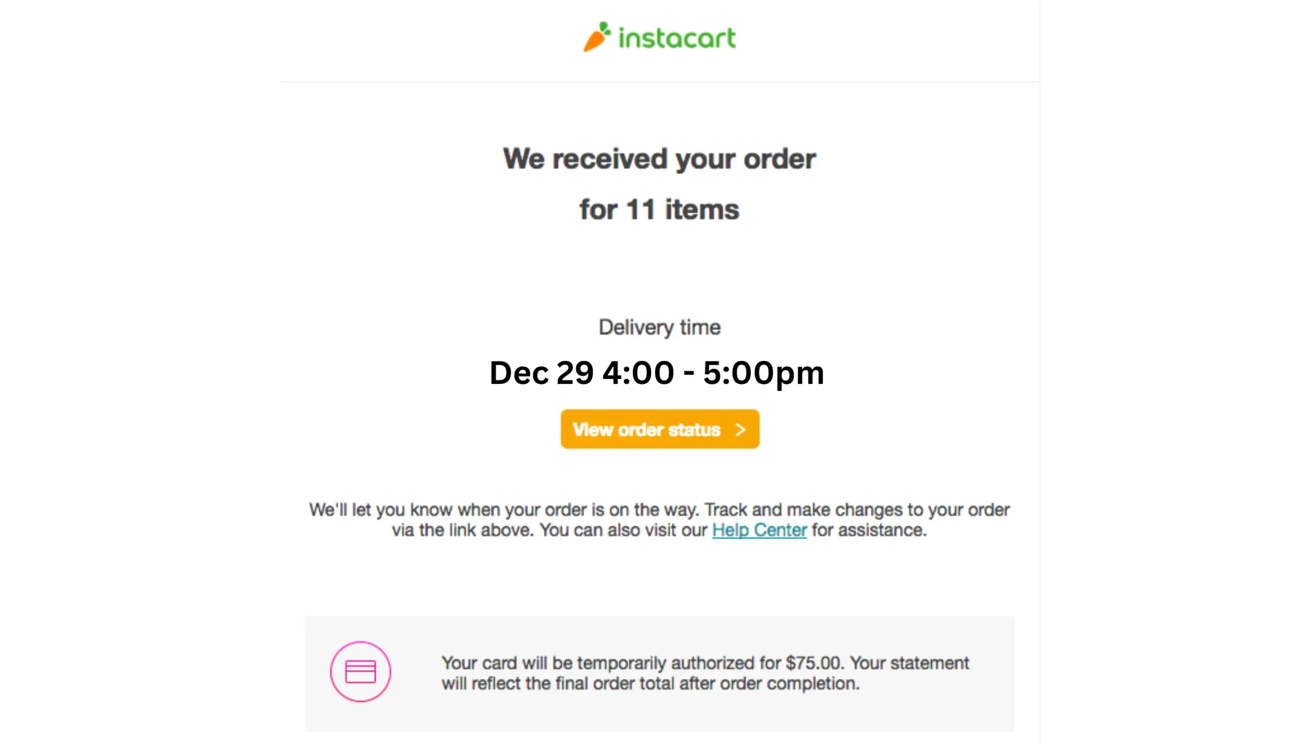
Example 8: Focus on Customer Convenience (Instacart)
Instacart’s emails are practical, providing an order summary, delivery time window, and options to modify the order. They include a helpful reminder to update the delivery instructions if needed.
Example 9: Highlight Social Impact (Patagonia)
Patagonia’s order confirmation email emphasizes the brand’s commitment to important causes. It includes a thank you message for the customer’s support and provides a link to learn more about the brand’s values and initiatives.

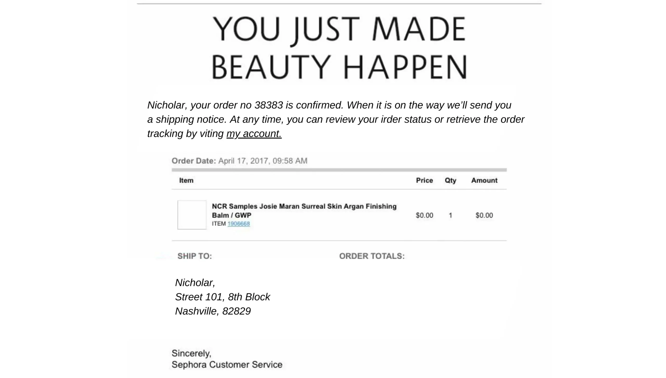
Example 10: Showcase Loyalty Rewards
This order confirmation email is visually striking, featuring a sleek design that aligns perfectly with the brand’s aesthetic. The email includes a clear summary of the purchase and relevant details, ensuring the customer has all the information they need.
Order Confirmation Email Templates
Template 1: E-commerce Store
Subject: Your Order #{OrderNumber} is Confirmed!
Hi {CustomerName},
Thank you for shopping with us! We’re excited to confirm your order. Here’s a quick summary:
Order Summary:
- Items: {ProductList}
- Total Amount: {TotalAmount}
- Payment Method: {PaymentMethod}
Shipping Information:
- Address: {ShippingAddress}
- Estimated Delivery Date: {DeliveryDate}
You can track your order here.
Need assistance? Contact our Customer Support Team or call us at {SupportNumber}.
Thank you for choosing {StoreName}!
Best Regards,
{StoreName} Team
Template 2: SaaS Subscription
Subject: Your Subscription is Active – Welcome to {ServiceName}!
Hi {CustomerName},
Welcome aboard! Your subscription to {ServiceName} is now active.
Subscription Details:
- Plan: {PlanName}
- Billing Cycle: {BillingCycle}
- Next Billing Date: {NextBillingDate}
Start exploring our features by logging into your account. If you’re new to this journey, check out our Getting Started Guide.
For any questions, you can feel free to reach out to our Support Team.
Cheers,
The {ServiceName} Team
Template 3: Travel Booking
Subject: Booking Confirmation – Your Trip to {Destination}
Dear {CustomerName},
Your trip to {Destination} is confirmed! Here are your booking details:
Booking Details:
- Flight: {FlightNumber}
- Departure: {DepartureDate}, {DepartureTime}
- Arrival: {ArrivalDate}, {ArrivalTime}
Accommodation:
- Hotel: {HotelName}
- Check-in: {CheckInDate}
- Check-out: {CheckOutDate}
For more information or changes, view your itinerary here.
We wish you a pleasant journey!
Warm regards,
{TravelAgencyName} Team
Template 4: Physical Goods & Services
Subject: Your Purchase Confirmation – Order #{OrderNumber}
Hello {CustomerName},
We’re thrilled to confirm your order! Here’s what you’ve purchased:
Order Summary:
- Product(s): {ProductList}
- Quantity: {Quantity}
- Total Price: {TotalPrice}
Delivery Information:
- Address: {DeliveryAddress}
- Estimated Delivery: {EstimatedDeliveryDate}
You can track your order status anytime.
Need help? Contact our support team at {SupportEmail}.
Thank you for choosing {CompanyName}.
Best wishes,
{CompanyName} Team
Common Mistakes to Avoid in Order Confirmation Emails
- Sending delayed emails: Ensure that confirmation emails are sent immediately after the purchase to avoid customer confusion and anxiety.
- Overloading the email with too much information: Stick to essential details to prevent overwhelming the customer.
- Using a generic, impersonal tone: Personalise the email to create a more engaging and trustworthy communication.
- Neglecting mobile optimisation: Make sure the email is mobile-friendly to accommodate users accessing it on different devices.
- Forgetting to include customer support details: Always provide clear contact information for customer support in case of issues or inquiries.
Order Confirmation Page
Confirming the Transaction
The order confirmation page reassures customers that their transaction was successful, alleviating any doubts or concerns they may have about the purchase.
Summarising the Order
A comprehensive order summary is essential, as it allows customers to review their purchase details for accuracy and providing a reference for future inquiries.
Highlighting Expected Delivery
Customers appreciate knowing when to expect their orders. Including an estimated delivery date on the confirmation page helps set expectations and enhances the shopping experience.
Encouraging Account Creation
Prompting customers to create an account on the order confirmation page can facilitate future purchases and help build customer loyalty by offering personalised experiences and benefits.
Offering Future Discounts
The order confirmation page is an excellent opportunity to present promotions or discounts, encouraging customers to return for future purchases and increasing customer retention.
Keeping It Simple
A clean and simple design on the order confirmation page ensures that essential information is easily accessible, preventing confusion and enhancing the user experience.
Frequently Asked Questions
Q1: How do I know if my order confirmation email is correct?
To ensure your order confirmation email is accurate, check that it includes all key details, such as your order number, items purchased, quantities, prices, and delivery information, if any.
Q2: Is order confirmation a receipt?
No, an order confirmation is not a receipt. It serves as a confirmation of your purchase, detailing the items ordered and other relevant information. A receipt, on the other hand, is a formal record of the transaction, usually issued after payment is processed and the order is fulfilled.
Q3: How quickly should an order confirmation email be sent?
An order confirmation email should be sent immediately after the purchase is completed. Prompt delivery of the email reassures customers that their order has been received and is being processed.
Q4: Can order confirmation emails help with customer retention?
Yes, order confirmation emails can significantly aid in customer retention. By providing a positive post-purchase experience, clear information, and additional value through personalised recommendations or promotions, these emails help build trust and encourage repeat business.

