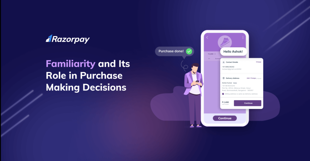
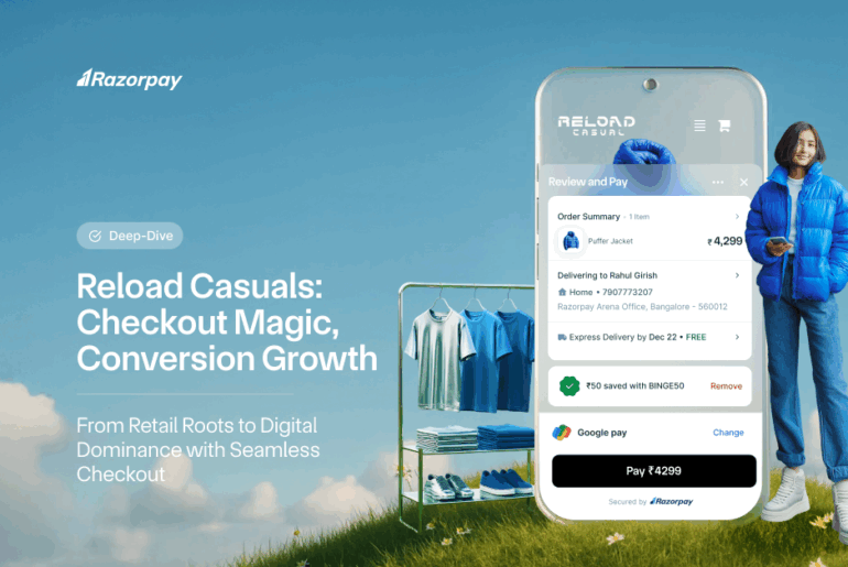
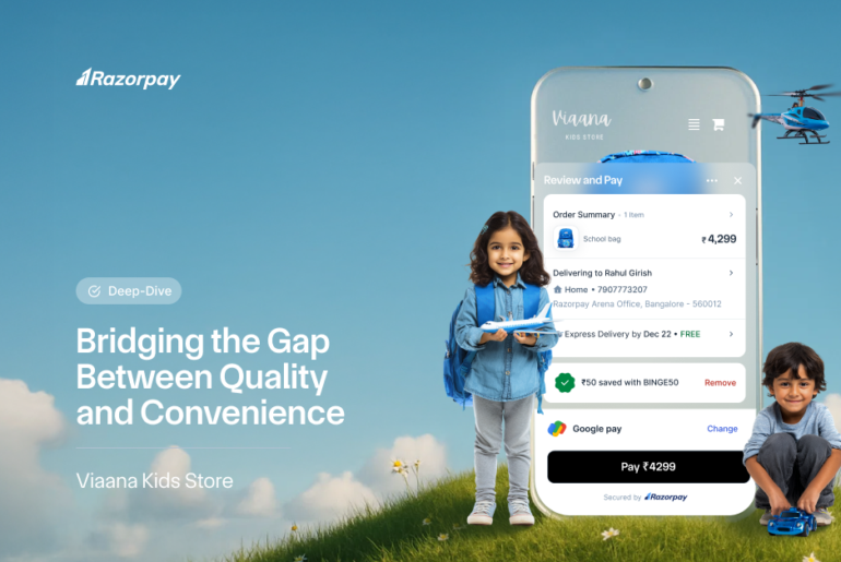
“Familiarity creates a sense of comfort, which allows customers to shop more from online stores that are familiar to them.”
The eCommerce sector is booming, and it is expected that eCommerce will continue its upward trajectory in the upcoming years. But as eCommerce grows, so will the number of eCommerce entrepreneurs. And that’s when figuring out what will work for an eCommerce business growth becomes prudent.
eCommerce businesses always look for a competitive edge to stay one step ahead of their competitors. There are some basic things that an eCommerce business needs to take care of, such as making and maintaining the right impression, engaging with customers, and providing customers with good quality products and services.
But, there is one aspect that eCommerce businesses often overlook, which is “Familiarity.”
Familiarity is a potent tool that one should add to their marketing arsenal. And if eCommerce businesses want to attract more customers, they should leverage the familiarity aspect.
Understanding the Concept of Familiarity
Human beings are complex creatures, and they find comfort in things that are familiar to them. For example, human beings are more attracted to and willing to make friends with people who have familiar personalities.
And the same theory can be applied to purchase making decisions. Research has suggested that customers trust brands that provide a familiar shopping experience. Familiarity works as a prerequisite for purchase-related decisions.
Research has also found that customers prefer brands they are familiar with and that lessens their burden to understand the purchase process. Hence, they are more willing to stay with familiar brands than those that provide them with a new shopping experience.
The Three Theories of Familiarity
Familiarity leads to comfort, and there is science behind the familiarity theory. As people are exposed to one particular environment, they find comfort in that familiar environment. The stimuli they receive can be of any kind, but people are more likely to go with a familiar stimulus rather than risk something unfamiliar.
Three theories that explain the concept of familiarity:
Cognitive Fluency
According to psychologists, cognitive fluency influences the brain to assess information. For example, if an online store is easy to pronounce, customers are more likely to shop from it. If customers find the payment page familiar to those they have filled already, they are more likely to stay and purchase.
The human brain wants to process information that is easy to understand and won’t let it exert more energy. The human brain is lazy, and the moment it finds a situation that is familiar and easy to process, it shifts its attention there.
Prototypicality
The brain always looks for prototypes. Simply put, when the brain becomes familiar with a situation or an environment and has an idea of how something works, it automatically programs itself and works accordingly.
For example, a customer shops from an online apparel store and is acquainted with the overall shopping experience of that particular online store. The same customer visits another online apparel store and expects the other apparel store to provide them with a similar shopping environment.
Habit
Human beings do things out of habit. If a customer is habitual to shop from Amazon because they are familiar with the layout, design, shopping experience, checkout page, etc., they are more likely to visit Amazon rather than a new eCommerce website.
It’s hard to break habits, and one can apply the same logic to online shopping habits. And one of the main reasons why customers hesitate to shop from a new or unknown online store is that they aren’t sure whether the shopping experience will be familiar to them.
Since Amazon asks customers to create only one account and the shopping experience is the same for every purchase, customers feel comfortable and start building the habit to shop from Amazon.
How Does Familiarity Benefit eCommerce Stores?
Whenever a customer visits an unknown online store, they encounter a new environment. From the way the website has listed its products to the layout, everything seems new to the customer.
Customers tend to lose interest in online stores that they aren’t familiar with. The moment they find a disconnect, customers drop out, which leads to business loss.
Familiarity works as a hook. It influences customers to spend more time in a store and finally buy from it.
And familiarity should be there throughout the shopping experience- right from the beginning, when a customer browses products, adds them to the cart, proceeds to the checkout page, enters their details, selects a payment method to when the customer completes the purchase.
The same thing happens to customers when they visit a brick and mortar store. The store is new, the way their products have been displayed is new, customers don’t know where the trial room is, or the cashier is. So, the absence of familiarity often tricks the mind into thinking that the shopping experience won’t be good leading to feeling more inclined to visit a store that they are familiar with.
In a physical store when customers recognize the salesperson or the person at the counter, they trust the company resulting in a good shopping experience. Customers tend to return to such stores more often than go to a store where nothing is familiar.
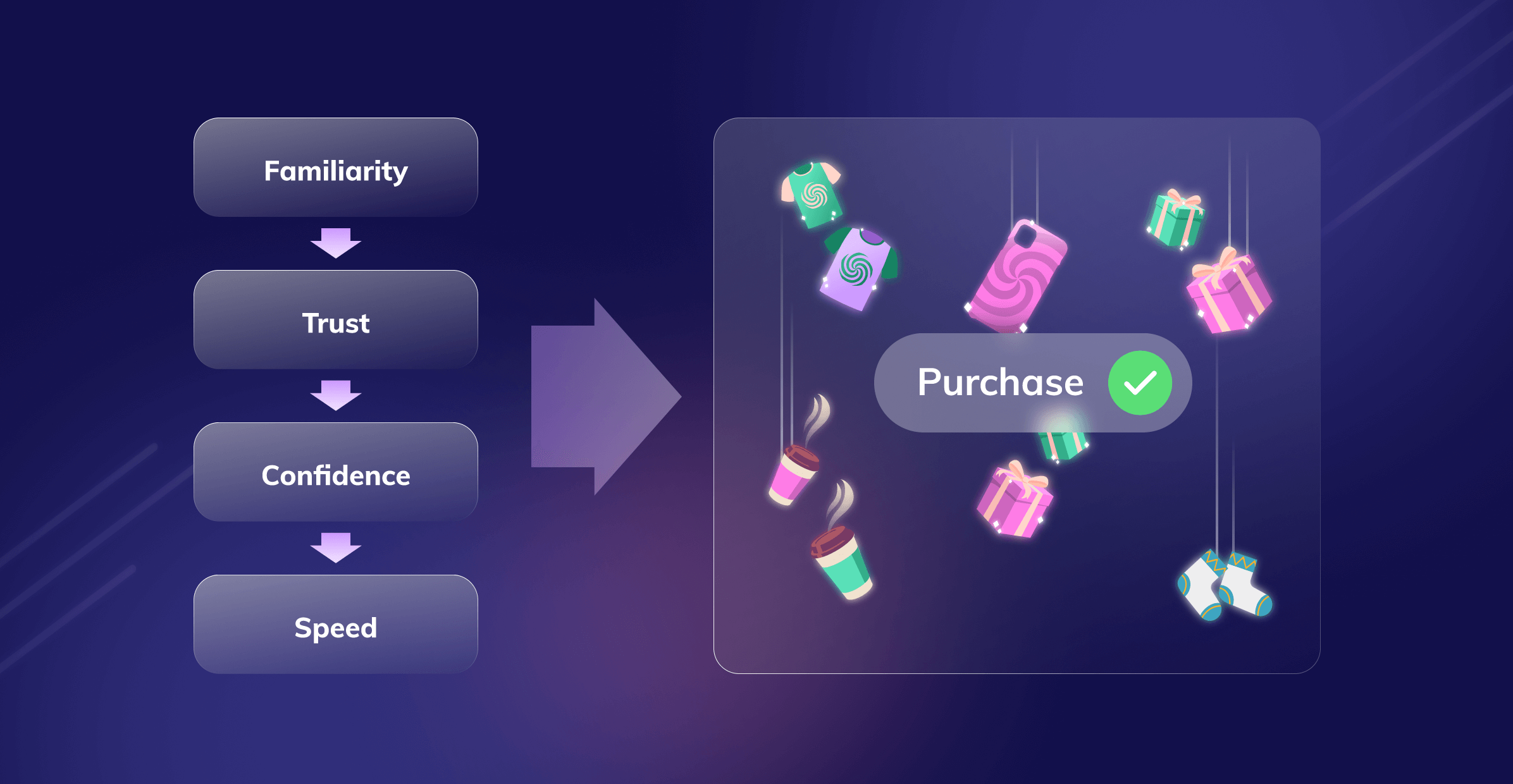
Here are the detailed steps of how familiarity influences decision making:
Step 1: Familiarity invokes trust in an online store. Since the shopping experience of an online store seems familiar to customers, they prefer to trust it more than those that aren’t familiar to them.
Step 2: Trust leads to feeling confident that the overall shopping experience will be pleasant, allowing them to feel comfortable. For example, customers who shop online regularly are familiar with the steps to make a purchase. So, when they visit an online store that provides them with a shopping experience that is familiar to them, they feel confident to shop.
Step 3: Since customers feel comfortable, they find the purchase process convenient. Customers know how to interact with an interface and proceed further. For example, they know that after selecting products, they need to add them to the cart; after that, they need to enter address details, and so on.
Step 4: Finally, convenience leads to speed. Since the customer knows the process is convenient to follow, they navigate with ease and complete the checkout process fast—the likelihood of dropping off decreases because of a familiar shopping experience.
How Can Familiarity Boost Conversions?
As said earlier, familiarity works as a hook. The more familiar a shopping experience, the more confident the customers will become to shop from an eCommerce store. And familiarity can help eCommerce businesses boost their sales and revenues!
By taking care of a few simple things, eCommerce businesses can create a familiar environment for their customers. Here are some tips that can help.
Design and UX
An online store’s design can make or break sales. The simpler the design is, the more customers are drawn to it. Keeping the overall UX (user experience) and design minimalistic can allow customers to make faster decisions.
Here’s an example of a hypothetical online store. There is an online store that sells fashionable clothes. The brand uses one colour across the online store to maintain the connection between its customers and the brand itself.
A customer visits the online store and finds the clothes properly segregated, such as shorts, denim, pastel dresses, shirts, etc. Each product has a description. It also has testimonials and images, and everything a customer wants to see. The customer finds the information easy to understand; hence, processing the information becomes convenient.
So, how do the three theories of familiarity work with this example?
Cognitive Fluency: When an online store’s design is easy to understand, it puts less strain on customers. For example, if an online store has listed the products correctly, the fonts are easy to understand, and each product has proper information, customers tend to spend more time in such stores.
Prototypicality: Using the clothes store example, the customer is able to understand the overall design conveniently. Since it has become familiar with the user experience, the subconscious mind is getting programmed to shop.
Habit: The customer has become habitual to the design of the clothes store and will expect to see a similar design for the rest of the products. For example, if the online clothing store suddenly stops displaying product descriptions for new clothes, the customer will become confused. That’s why maintaining the same familiar design across the website is vital.
Familiar Terminology
Another minute detail that online businesses often overlook is the usage of common and familiar terminologies. Customers don’t want to exert energy in understanding new or difficult words.
The more time a customer will take to understand what is written on an online store, the more disconnected they will feel.
For example, zip code is not understood by many Indian customers, whereas pin code is. It is always better to use terminologies that customers will easily understand.
Cognitive Fluency: Going by the example, customers know the term pin code better than zip code or area postal code. The brain uses less energy when it sees the term “pin code” on an address page.
Prototypicality: The prototypicality here is seeing familiar terminologies in online stores. Pin code is familiar to them, and they have seen it on many other online stores, so they tend to stick with online stores that use familiar terminologies.
Habit: Since seeing familiar terminologies on online stores is part of their habit, customers are influenced subconsciously to shop more from stores that use simple language.
Avoid Dead Ends
An eCommerce store should avoid having dead ends. Every page should have a logical explanation and a connection to the next page. For example, if a customer comes to an online store, such as an online store that sells mobile accessories, it needs to show a logical connection between one page to another.
eCommerce stores should avoid pushing customers to take the next step that they want, which is buying a product, rather they should provide a step that will be more logical to the customer.
For example, when a customer clicks on a product, it shouldn’t take them immediately to the payment page; instead, it should take them to a page with the proper explanation of the product.
Cognitive Fluency: Going by this example, customers who visit a mobile accessory store want to know more about the products. So, sending them to a product description page allows customers to understand a logical connection between the previous and the latest page.
Prototypicality: Since the customer sees a product description for one product, their prototypical mind expects all the products to have a product description page. And when a product description page appears for every product, the brain processes it as a familiar environment.
Habit: Finally, the customer becomes habitual of seeing product description pages for every product. Hence, before making a purchase decision, they will like to continue this habit.
How Magic Checkout Helps in Creating a Familiar Shopping Experience?
Razorpay has been serving millions of eCommerce businesses with a familiar, standardised, clean, customer-friendly, and, most importantly, secure checkout for more than six years.
Since Razorpay has been working for millions of eCommerce businesses, it knows the pain points of these businesses. Razorpay believes in creating products that will be beneficial to online businesses. Take Magic Checkout, for example.
When customers visit Razorpay Magic Checkout network stores, they are presented with a familiar payment interface. An interface that doesn’t create any confusion and is easy to process and understand. This allows customers to trust such brands better.
Customers who have interacted with Magic Checkout network stores are familiar with the overall checkout experience.
Furthermore, if the business is a Razorpay Trusted Business, the Razorpay Trusted Business badge is displayed throughout the checkout experience, which helps build confidence.
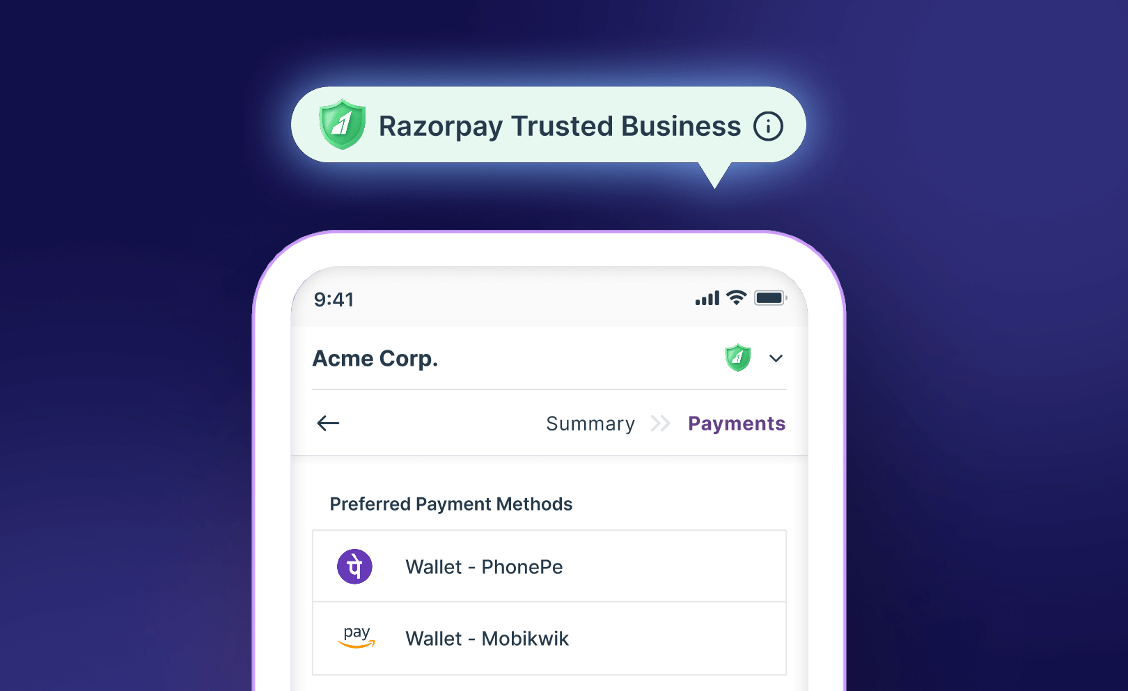
Just like an online store should look familiar to customers, it should make sense to them and enable them to shop online conveniently; the end to end checkout process should remain familiar to them as well.
Want to know more about how Magic Checkout can help eCommerce businesses create a familiar, safe, and trustworthy shopping experience for customers? Why not connect with the Razorpay Magic Checkout team today?
