Online business websites are a tapestry of pages, where each one holds the key to success’s stages.
Online businesses strive to engage customers and drive success through their eCommerce stores. The stakes are undeniably higher for online business websites, as they navigate a landscape where competition is fierce and expectations are soaring. 🌟🛍️
As an eCommerce business owner, you need to balance various factors like customer satisfaction, easy website navigation, and compelling content to boost conversions and revenue. 🤝🔍💰
Your online business website is the face of your brand. It needs to be flawless, with appropriate pages that cater to your business and customers. ✨🏬
Whether you already have an online business website or plan to build one, this guide is for you. It will help you understand the essential pages your online business website should have. 📚🌐
What Are the Most Important Online Business Website Pages?
In the following order, here are the pages that should be there in an eCommerce store👇:
- Home page
- About us page
- Product overview page
- Product detail page
- Shopping cart page
- Checkout page
- Return policy page
- Contact us page
Home Page
The home page of an eCommerce website works like the storefront. If customers like what they see, they stay and explore the range of products the online store offers, but if they don’t, they leave the eCommerce store and move on to another one. The home page is critical for customers to navigate across different pages of an eCommerce website.
What is a Home Page?
The home page is a gateway for visitors who need further direction and signposting. For customers who are new to an online business website, the homepage is the introduction to the eCommerce website.

Here Are Some Tips Which Will Help You
- It is always better to create a home page with a search box. Search boxes let customers search for relevant products quickly. Adding a search box to a home page will allow customers to find what they are looking for.
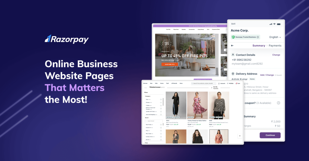
- Adding appropriate links to the homepage might help you display products adequately. Let’s say you have an online apparel store with dedicated products for men, women, and kids. Having category links will encourage users to begin their browsing journey smoothly.
- You can think of adding a new-in section to tell your customers about the latest collection. This way, customers wanting to look at new arrivals will easily locate the page they need to visit.
- Adding a few good customer reviews to the homepage might help you stand out and give confidence to customers, especially if you’re a new brand 😃!
About Us Page
This might surprise you, but many eCommerce websites skip the about us page thinking it is not required 😟! Instead, they add a small content piece in the footer section explaining who they are.
New online businesses, in particular, should never skip the “About Us” page. Your customers want to know you. So, use this space to advocate your brand, and don’t forget to use the five Ws- who you are as a brand, what you do, when it all started, where is your business located, and why you are the best; among the rest!
What is an About Us Page?
The about us page of an online business website is where the brand talks about itself. This is your personal space to tell your customers who you are, what inspired you to start this business, and your business ethos.
 Here Are Some Tips Which Will Help You
- Let the about us page tell your story. If you do that, customers will find it easier to trust your brand. Anything you think will be valuable for your customers, add that!
- On the about us page, think of adding the launch date of the company, what you offer, why you are different from others, what makes you stand out in the industry, and so on. This is for your brand image📈.
- The about us page can also have a few other sub-pages, such as “Our Story” and “Meet the Team”. However, if your business is new/recently started and has a small team, just the About Us page will do.
Product Overview Page
Although you can skip this part and directly have product detail pages, adding this page to your online business website will make your online store look well-organized 👍🏻.
What is a Product Overview Page?
A product overview page in an online business website is a page where an online store lists all the products they have for its customers.

Here Are Some Tips Which Will Help You
- This is the page where you make the online shopping journey convenient for your customers. This page will basically try to provide as many filters as possible so that customers can quickly find the products they are looking for.
- If you are an online apparel store, you can think of adding tabs, such as price, size, colour, etc. This will help your customers scrutinize their search and find the products they really want to look at. And if you are an electronic store, you can think of adding brands, price range, colours, etc. Yet again, the purpose of adding these filters is to let customers enjoy a smooth online shopping experience.
- You can also think of adding an option to add a product to the cart directly. This will fasten the online shopping experience letting your customers buy a product quickly.
These filters allow customers to narrow down their search and quickly find what they are looking for.
Product Detail Page
A product detail page is the heart of an eCommerce website. This is the page where a customer decides whether to buy the product or not. And that’s why a product page design should be carefully thought-out 😇.
What is a Product Detail Page?
A product detail page is for product description. There can be multiple product detail pages depending on the number of products your online store has. Whenever a customer clicks on a product, they are redirected to the product detail page.
 Here Are Some Tips Which Will Help You
The basic idea is to let the customers learn about the product in detail. No matter the type of eCommerce website you have, here are some tips to follow:
- A product page is a page where customers learn about a particular product. Keeping it detailed will give confidence to your customers to buy them efficiently.
- High-quality product images are a must! Customers have gotten used to scrolling through products, and unless your product really catches a customer’s eye, it won’t sell that well, even if it’s a good product!
- If it is a website for apparel, try to add as much information as possible, such as size, colour, material, design, etc. In the case of other products, be as informative as possible so that the customer can make a decision.
- Customers love discounts 😎! Calling out discounts and showing the original and discounted price next to each other has proven to be a strong conversion lever.
- Making your customers aware of the delivery and return policy gives them more confidence to purchase and allows you not to face any customer heat later. This way, customers will be aware of what to expect regarding delivery and returns.
Shopping Cart Page
When a customer decides to purchase a product from an eCommerce store, their products are added to a cart. And when they visit their cart to check what all products they have added, they are redirected to a page called shopping cart.
What is a Shopping Cart Page?
A shopping cart page is a web page where customers can see the products they have added to their carts. The shopping cart allows customers to review what they are purchasing before proceeding to the payment page and is a critical step in the online shopping journey.

Here Are Some Tips Which Will Help You
- It is always better to have product title, price, product image, and quantity on the shopping cart page so that your customers can cross-check the products they have added to the shopping cart. It allows them to confirm everything and proceed to the next page.
- Since you will want your customers to take action fast, think of adding a call to action button, such as “Pay Now” or “Buy Now”. This way, you will supercharge their online shopping experience.
- Although Delivery and Return information will be there on the product detail page, adding this again on the shopping cart page allows your customers to be absolutely sure about your delivery and return policies and not miss out on it.
- You can also add a link to continue shopping so that customers can shop more. Who would mind customers shopping for more, right🥳!
- Customers always prefer a clean design that’s easy to navigate. Adding a progress bar to tell the customers about the steps they have already completed and the next steps they need to follow will help. The progress bar can have tabs, such as summary>address>payment. This way, customers will stay well-informed throughout the online shopping journey and will have less inclination to abandon their carts😉.
Checkout Page
Once the customer adds the products to their shopping cart and decides to buy, the next step they will take naturally is to pay for them, and the page they get redirected to is the checkout page.
What is a Checkout Page?
A checkout page is where customers pay and complete their online shopping journey. The checkout process will have two essential elements. One is choosing the delivery address, and the second is the payment method to complete the transaction process. And this is checkout’s meaning.

Here Are Some Tips Which Will Help You
Now that you know checkout’s meaning, here are a few tips for you. 18% of customers abandon their carts when they find the checkout process complicated 😱. Hence, by minimizing the steps to complete the checkout process, an online store will increase the chance of customers shopping from them.
eCommerce stores can take advantage of checkout providers like Razorpay Magic Checkout ✨ to smoothen the checkout process and minimize the steps for their customers. The idea is to make the customers invest less effort and time to pay for the products they like. And Razorpay Magic Checkout wants your customers to have a truly magical shopping experience💫!
To make the checkout process frictionless and smooth, take care of the following things:
- This is the page where your customers provide their shipping and payment details in order to pay for the products if they are new. Else, if they are repeat customers, they would like to find their addresses and payment details quickly to complete their purchase process. Therefore, try to provide a checkout page to your customers that they can trust. Join hands with Razorpay Magic Checkout, and give freedom to your customers to checkout quickly so that you can earn more revenues🤩.
- Let your customers find the address where they want their orders to be delivered super fast. Customers who shop from Magic Checkout network stores never have to worry about filling out lengthy account creation forms just to checkout. Everything gets automatically and magically prefilled, allowing customers visiting your online store for the first time to enjoy a repeat-like shopping experience.
- You can think of letting your customers choose from multiple payment options, including cash on delivery. Many customers place COD orders, particularly when shopping from a new online store. Magic Checkout gives online stores the flexibility to disable the COD payment option in real-time for high-risk orders, encouraging customers to prepay. Magic Checkout analyses each order and red flags the high propensity to Return to Order (RTO) orders based on customers’ historic RTO patterns across multiple brands in the Magic Checkout network.
- Gone are the days when customers used to choose between COD and online payments separately. With Magic Checkout, all payment methods, including cash on delivery, are shown in a single listing view. This allows customers to choose their preferred payment method faster and place an order without any hassle.
- Another thing that Magic Checkout does for you is it enables you to show relevant discount coupons or coupon codes conveniently. It creates a coupon listing view, making it easier for your customers to understand what coupons are available so that they can apply the one most suitable for them. This, in return, reduces the time and effort customers spend in finding coupons online✌️.
Read Also:Amazfit Increased Its Order Conversion Rate by 30% with Razorpay Magic Checkout🚀!
Return Policy Page
An eCommerce website with a bespoke return policy page is trusted the most, which is why every eCommerce website needs a dedicated page that explains the return policy properly. Some customers may assume that you offer refunds even if you don’t, which might cause problems later if they want a refund. Therefore, it’s better to have a detailed return policy page that explains everything.
What is a Return Policy Page?
A return policy page is a page where customers find detailed information about how a company processes returns in case of any. Things happen, and some customers may want to return products, and it is a good practice to have a transparent return policy.
 Here Are Some Tips Which Will Help You
As said, the return policy page should be as detailed as possible. A few things to keep in mind are:
- Let customers know in how many days they can return a product and under what conditions. To make everything clear, you can include things like the product must be returned along with the receipt, tags, original packaging, etc., on the return policy page.
- Customers would like to know when their money will be back in their account if you offer a refund. So, think of letting your customers know when they can expect their refund to get processed and completed.
- If you don’t offer a refund but only an exchange, let your customers know about it on the return policy page. This will save you from a lot of issues in case customers ask for a refund. Some customers will want to know if a company does return and refund or return and exchange. So, why not make it clear on the return policy page 💁♀️?
Contact Us Page
Whether you have a physical store or not, every store needs contact us page via which customers can reach you directly. The success of your business mainly depends on the kind of customer support you provide to your customers.
What is a Contact Us Page?
A contact us page is a web page for customers to find the contact information of a company. Every eCommerce website should have a dedicated contact us page.

Here Are Some Tips Which Will Help You
- You will undoubtedly want to provide the best customer service to your customers. So, think of adding the company’s phone number and email ID so that customers can quickly reach out to you.
- Along with providing your contact details, you can also add a contact us form in case customers want someone to call them.
- If you have a physical store, think of adding the complete address on the “contact us” page. Addresses always have a positive impact on customers, and it builds trust as well.
- You can also add links to your social media accounts, such as Facebook, Twitter, Instagram, Pinterest, etc. The more ways you will add to reach out to you, the better it is for your customers😃.
Wrapping Up
As you embark on perfecting every aspect of your online business website, there exists a singular page where Razorpay Magic Checkout unveils its transformative power—the checkout page. Allow Magic Checkout to orchestrate an enchanting checkout experience, one that captivates and enthralls your customers, leaving them enamored. ✨🛒
Magic Checkout works its wonders by seamlessly prefilling delivery details and customer information for those who have previously shopped within the expansive Magic Checkout network. This ingenious feat empowers your customers to complete their purchase with a breathtaking 50% increase in efficiency. 🚀💨
Should you seek guidance in harnessing the full potential of your checkout process and discovering the myriad benefits that Razorpay Magic Checkout bestows, do not hesitate to reach out to us at magic-checkout@razorpay.com. We stand ready to assist you on this extraordinary journey. 🤝🌟
Read Also: Fire-Boltt Increased its Order Conversion Rate by 50% and Reduced its RTO Rate by 33%!🚀


