Digitalisation has been a boon for everyone. Merchants can easily set up an online store to start selling their products, and likewise, customers can buy from such stores conveniently.
However, since the digital sphere is cut-throat, only those who invest in providing their customers with the best shopping experience can stand apart from the crowd. And that includes the checkout experience.
And contrary to popular beliefs that checkout is only the payment page, everything from the product page to payment completion constitutes checkout. To define checkout, it’s the series of steps a customer follows to add the product to the shopping cart and finally pay for it.
Because of the increasing competition, online stores should leverage the power of technology to provide a personalised shopping experience to customers that will be both enjoyable and easy to navigate.
While setting up an aesthetically appealing store is necessary, taking care of the checkout journey also plays an equally important role.
What is Checkout?
Checkout is a term used in an online shopping journey where a customer wanting to purchase a product finalizes their purchase process by paying the online store. This is where the purchase gets completed.
Understanding the Importance of Checkout
Any drop in the checkout journey means a loss of revenue for a business. Imagine running a physical store for apparel and seeing customers exploring the range of products, adding them in the shopping bags, moving towards the cashier to pay for the items, and finally leaving the store without buying anything.
Unable to convert traffic into buyers clearly means a loss of revenue. Let’s use the same example for E-commerce businesses. Customers who add items to their shopping carts are high-valued. Even one friction in the checkout process can make the customers abandon their carts, leading to business loss. Therefore, there should be zero friction for users when they transact.
The ease the customers feel while exploring the products and adding them to the cart should be continued when they finally decide to pay. A slight disconnect, and customers will take no time to abandon their carts. The checkout process should not only be smooth but structured, easy to understand, and shouldn’t have any disruptions.
Research done by Baymard Institute stated that the average cart abandonment rate is 69.82%. Moreover, in a recent survey done by Razorpay, 30% of entrepreneurs said that their single most significant challenge is converting visitors to paying customers, and checkout has a vital role to play in that.
Businesses tend to focus more on operations, sales, and marketing and often underestimate the power of the checkout journey. However, what’s the use of generating traffic to an E-commerce site if it fails to convert them to paying customers? What if a business is facing a high cart abandonment rate?
There is no point in getting more users to an E-commerce website or app if the checkout funnel is broken. Eliminating this friction or fixing the broken checkout funnel is the key to success for any E-commerce business.
How Bad Checkout Experience Drives Customers Away?
When a customer shops online and till the time they pay, they have to go through multiple steps. So, even if an online business can’t change a customer’s mind if they don’t like a product, what they can do is save customers from having a bad experience when they proceed to checkout.
What’s commonly seen in checkout pages is that a customer has to fill multiple forms. As per Baymard, there are 11.8 form fields a customer has to fill on average before actually completing a purchase. Now, that’s tedious and one of the reasons for cart abandonment.
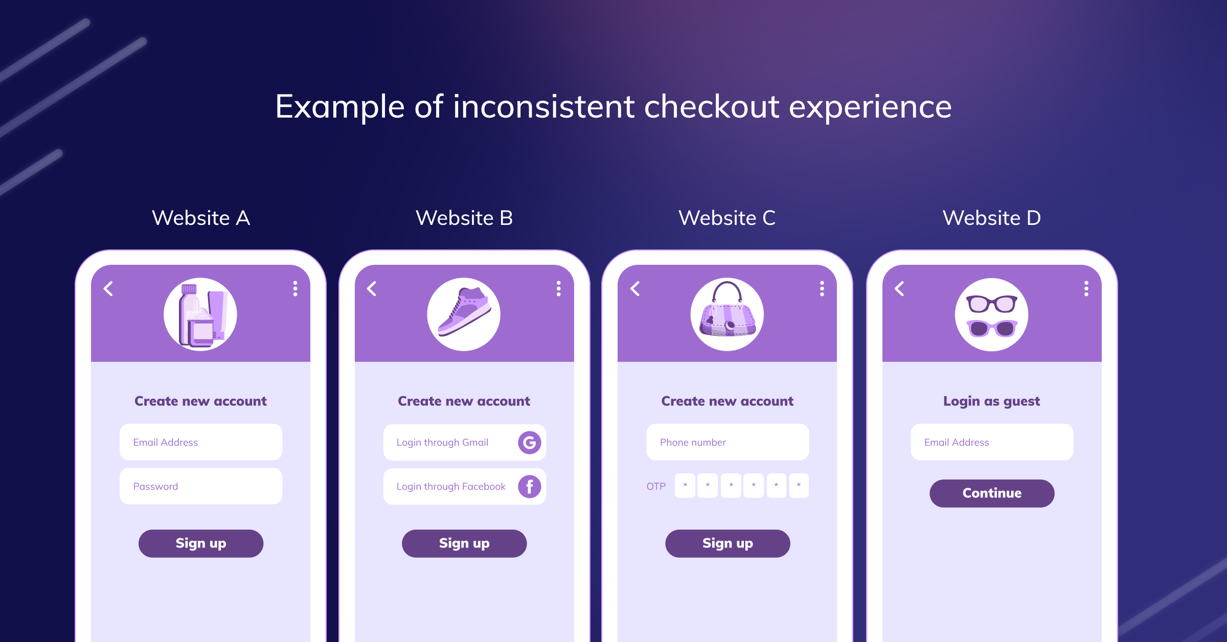
Moreover, inconsistent checkout experiences across brands also lead to drop-offs/cart abandonment. For example, imagine a shopper named John visiting websites A, B, C, and D. All four websites are for apparel. While every website tries to provide an optimum shopping experience, seeing different flows and layouts for checkout do create confusion.
John visits website A where he is asked to create an account + password. Website B asks him for FB/Google verification to proceed to the checkout; website C only asks for phone number and OTP, while website D allows guest checkout and the rest don’t. This is what causes an inconsistent checkout experience.
Merchants use different E-commerce platforms, such as WooCommerce, Shopify, Magento, etc., because they provide exceptional services and hundreds of plugins. And merchants use these plugins to further optimise their website and Woocommerce checkout or Shopify checkout flow.
However, since every plugin and platform is different, the checkout flow merchants provide to their customers ends up becoming complicated, diverse, and non-familiar.
Unable to understand the checkout flow or design causes friction because this causes difficulty in navigating the store, which unfortunately leads to cart abandonment, causing business loss.
Let’s share an example. There are three websites- A, B, and C and each offers different layouts/designs. Website A asks John to enter a three-line address, website B asks for a two-line address, and website C tells John to add the current location based on their GPS coordinates.
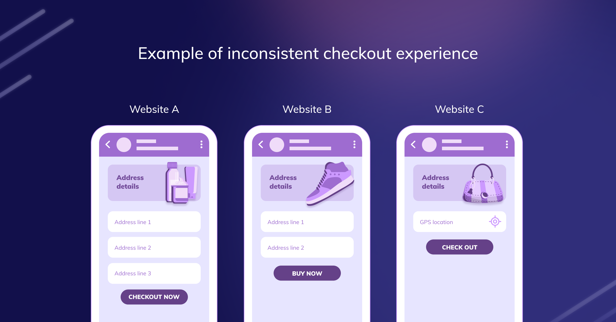
Along with that, website A uses “Checkout Now” as their CTA, website B uses “Buy Now,” and lastly, website C calls it “Checkout.”
All these lead to inconsistent checkout experience, which causes friction in the checkout flow, ultimately leading to business loss.
How Difficult is it to Manage Checkout on Your Own?
Managing and maintaining checkout can be highly complex, primarily because there are multiple things that one needs to take care of. For example, incentivisation, flow optimisation, account creation, personalisation, address and information intake, product upsell, payments, etc.
Large companies have 100 member teams to optimise checkout. But for small and medium-sized businesses, managing checkout on their own cost an exorbitant amount of business capital as well as time.
Design: Checkout needs to be designed in a frictionless manner, which is not a straightforward thing to achieve. Businesses use multiple plugins and themes to beautify checkout but, in reality, make it complicated since they often miss out on many crucial design elements.
Trust: A new business needs to build authority and gain customers’ trust so that customers take the step to invest in their business by shopping from them. This consumes time since building trust is a time-consuming process.
Incentives: Customers love coupons because coupons allow them to save money on their current or next purchase. This is a way to retain customers and make them come back for more. However, creating coupons, showcasing the correct coupons, personalizing them, and offering the proper discount to complement their purchase require adequate skills and expertise.
Payments: Checkout needs to have payment instruments to show—for example, UPI, net banking, card payments, digital wallets, international payment gateway, etc. Some customers prefer COD, while others opt for EMIs. Along with this, one needs to comply with regulations, maintain uptime, etc. All in all, personalizing this experience can be a herculean task.
Related Read: What are the Different Types of Digital Wallets?
How Can Razorpay Magic Checkout Help You Manage Your Entire Checkout Flow?
Razorpay has been serving millions of E-commerce merchants with a clean, intuitive, customer-friendly, and most importantly, secure checkout for more than six years. Our checkout domain expertise makes us a go-to checkout provider for merchants who want to offer a structured checkout experience to their customers.
Along with many other products we have developed, Razorpay introduces Magic Checkout, which can be enabled/activated effortlessly. Magic Checkout enhances your chance of increasing sales by 20% by providing a faster, safer, easier, and more rewarding checkout experience.
Magic Checkout automatically prefills delivery details and information of customers who have shopped previously from Magic Checkout network stores, allowing customers to checkout 50% faster.
Sounds interesting? Here’s more:
Expertise: Razorpay has a dedicated team that manages and provides a customized and optimum checkout experience to your customers.
Design: You get a clean, seamless, and intuitive checkout, which has been designed keeping in mind Indian shoppers and a mobile-first approach.
Trust: Razorpay is a trusted checkout partner for millions of businesses across India, and customers are familiar with the interface we provide. Furthermore, if the business is a Razorpay Trusted Business, Razorpay Trusted Business badge gets displayed throughout the checkout experience, giving confidence to the customers.
Payments: We support all payment methods, including COD, show relevant success/error messages, and provide 99.9% uptime. Not just this, we are fully compliant with RBI and currently support over 100 currencies.
E-Commerce is here to stay, and as sellers try to expand their businesses, they should think of providing the best checkout experience to their customers to boost customer engagement and sales.
And now that it’s clear about the range of elements that constitutes checkout, why not connect with our team to learn more about Magic Checkout and figure out how it can be helpful for your business.
Remember, the checkout experience can make or break your business!
