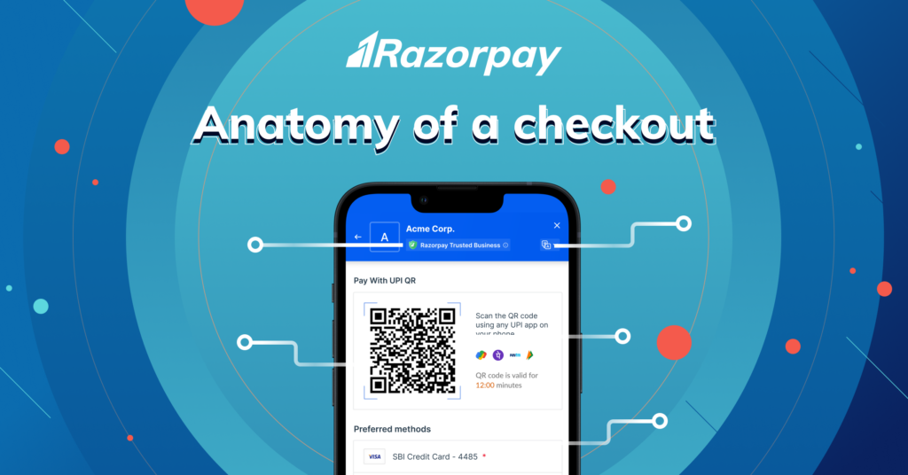
A broken experience when trying to pay for an online purchase can be heartbreaking. You find what you are looking for, you add to cart and if there are hiccups at this stage, you are very unlikely to return.
Preventing this with a seamless checkout experience is paramount for businesses along with understanding the pivotal role a well-crafted payment checkout page plays. An optimised payment checkout experience can also yield substantial monetary benefits, elevating revenue generation while mitigating the risk of return-to-origin transactions. A seamless and user-friendly checkout process encourages customers to complete their orders promptly, resulting in a significant boost in overall sales.
Beyond financial gains, a professionally designed payment checkout page also exudes a sense of professionalism and reliability, strengthening a brand’s identity and building customer trust. With customisable options, businesses can incorporate their branding elements, presenting a cohesive and consistent brand image and experience. This visual coherence fosters a lasting impression, instilling confidence in customers as they proceed through the checkout process. Moreover, an aesthetically appealing checkout page enhances the overall shopping experience, leaving customers satisfied and more likely to return for future purchases.
So Why are Most Checkout Pages Broken?
Designing flawless checkouts for businesses is no small feat. In fact, it’s akin to navigating a labyrinth with numerous unique challenges.
From a plethora of payment methods to diverse modes of authentication, the presence of multiple entities, policies, and regulations, and a user base that is still acquainting itself with the nuances of online shopping – it’s a whirlwind of complexity. Not to mention the cherry on top: the often lagging internet speeds that add an extra layer of frustration.
But, while the digital payment landscape might be complex behind the scenes, the end goal is simplicity for users.
You’ve Seen Checkout Pages, but have You Really Looked at Them?
There’s a lot that happens behind the scenes from the moment you reach the checkout page till you see that payment and order confirmation. To understand what makes a checkout page not just good but stellar, let’s take a closer look at all the individual parts that come together to make magic happen.
The Recipe for a Seamless Checkout!
Imagine you’re on the hunt for the perfect pair of shoes. You’ve scoured the internet, and finally, you find them on a trendy e-commerce website. You’re ready to make the purchase, but the checkout process gives you the jitters. This is what we’ve solved for you with Razorpay Checkout that is powered by its cutting edge AI/ML engine. Let’s take a closer look at it!
Branded and Integrated Checkout:
Now, imagine the checkout page automatically adopting the same colours as the website you’re on. Your shopping experience remains consistent, and trust levels rise as you realise that this is indeed a seamless extension of the website you trust. You’re not met with a jarring redirection; instead, it feels like a familiar part of the shopping spree. Talk about a non-broken, reassuring experience!
Language, A No-Worries Zone:
And to make every checkout experience tailor-made, based on your geo-location in India Razorpay Checkout effortlessly adjusts to your preferred language. No matter which part of the country you are in, your checkout journey is smooth and comprehensible. No language barriers can stand in your way!
Auto-Fill Delight:
Nobody enjoys the never-ending task of inputting endless details! With Razorpay’s checkout, that’s history. Your shipping and payment details are stored securely, and with a tap, they’re auto-filled. Thanks to a data network of over 200 million customers, there’s no need to race your keyboard for the umpteenth time – a few clicks, and you’re good to go. Shopping was never this swift and hassle-free.
The Best Payment Methods, Front and Center:
Now, it’s time for the grand finale. The checkout page is equipped with the wisdom of experience. It studies transaction success rates and showcases the most effective payment methods. Just like a personal shopping guru, it guides you towards the path of least resistance, ensuring a successful transaction every single time. You’re not left guessing – Razorpay’s got your back!
In the world of online shopping, Razorpay’s checkout experience transforms you from a wary shopper into a confident buyer. From AI personalisation to seamless branding, language magic, and automatic payment optimisation, every aspect harmoniously comes together like the notes of a symphony. So, whether it’s shoes, gadgets, or gourmet treats, with Razorpay, your checkout journey is an enchanting tale of convenience and satisfaction.
