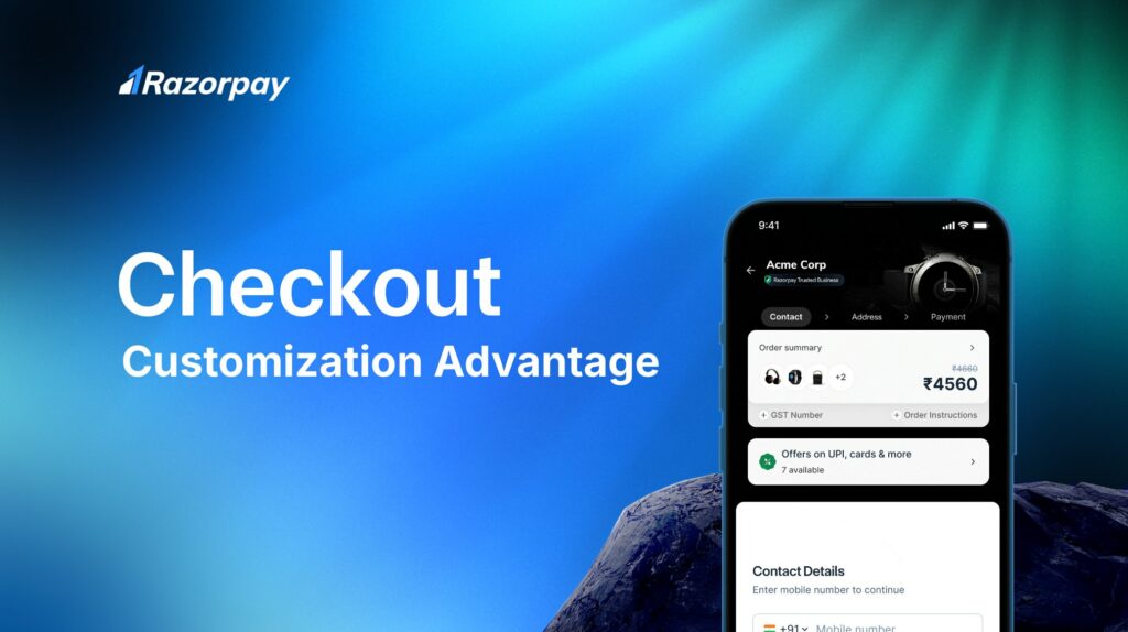
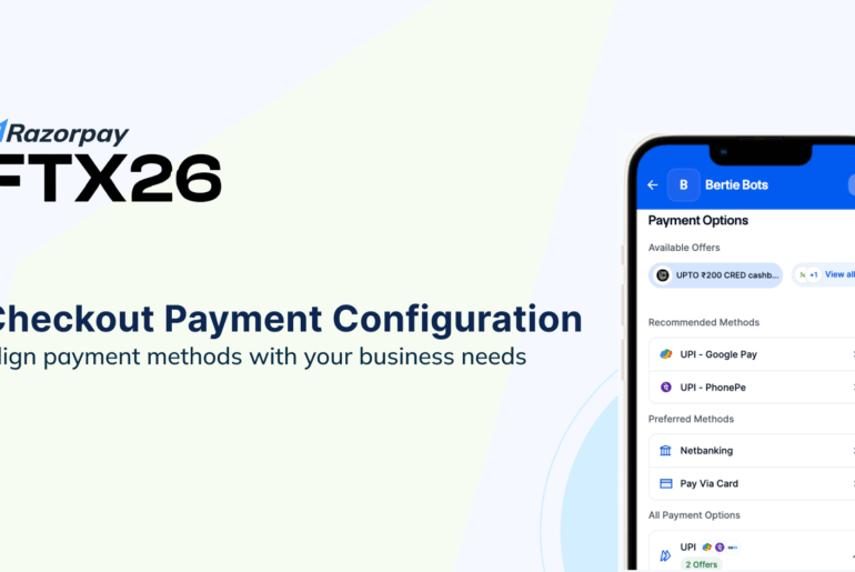
Every interaction with a customer is an opportunity to build trust and loyalty and drive sales. The checkout page, often the final milestone before a purchase, is a critical touchpoint. It’s an opportunity to not only finalize the sale but also enhance the customer experience and build brand loyalty. Recognizing this, Razorpay has introduced extensive customization options that empower businesses to create checkout experiences that truly reflect their brand identity and leave a lasting impression on customers.
TL;DR: Customize Your Checkout, Boost Your Brand
Creating a personalized, branded checkout experience has never been easier with Razorpay’s customization features. Here’s how you can get started:
Go to Styling Dashboard– Dive right into the design options for your checkout page.
How to Enable– Step-by-step guide for enabling checkout customization on your store.
Get Magic Checkout– Simplify your checkout process today!
Checkout Customization: Elevate Your Brand at Every Step
 Customizing your checkout page isn’t just about aesthetics; it’s about crafting a seamless, branded experience that aligns with your business values and resonates with your customers. Here are the key ways you can customize your Razorpay checkout page:
Theming Customization
Personalize the checkout page with your brand’s colors, logo, and design elements. Razorpay’s intelligent theming engine allows businesses to create a cohesive experience by automatically generating an entire color palette from a single primary color. Whether you prefer solid colors or creative patterns, your checkout page can reflect your brand’s unique style. For different festivals and occasions, you can add festive themes to make the checkout experience more engaging and relevant. You can also implement branded banners to match your campaigns, making every interaction feel timely and impactful.
Read more: Checkout Goes Festive: Boost Conversions with Seasonal Themes

Language Customization
Engage with your customers in their preferred language by setting a default language for your checkout page. This feature ensures that your audience feels comfortable and connected during their purchasing journey.
Sidebar Design Customization
Choose from various sidebar designs to make the checkout process visually engaging. With these customization options, you can ensure that your checkout page maintains consistency with the rest of your online store, offering a seamless and welcoming experience for customers.
New Feature: Custom Messaging Banners
 Taking customization to the next level, Razorpay now offers custom messaging banners. This feature allows businesses to create personalized messages directly on the checkout page, providing a powerful way to engage customers and drive conversions at the critical moment of purchase.
Whether it’s announcing a seasonal sale, highlighting a special offer, or nudging customers towards prepaid options, these banners let you convey essential information in real-time. With just a few clicks, businesses can access their Razorpay dashboard and craft a message that resonates with their audience.
Example banner texts:
“Limited-time offer: Get 20% off on all orders!”
“Free shipping on prepaid orders!”
“Don’t miss our seasonal sale! Up to 50% off!”
Read Also: A Brand-New Checkout from Razorpay is Here!
The Benefits of Checkout Customization
Increase Conversions
Customizing your checkout page—from visual elements to messaging—helps guide customers smoothly through the purchasing process, reducing friction and encouraging them to complete their orders.
Enhance Customer Experience
A personalized checkout experience fosters stronger customer connections. By offering a checkout page that reflects your brand’s identity, you build trust and loyalty with your customers.
Drive Specific Actions
Whether you’re promoting prepaid orders, highlighting exclusive offers, or sharing important updates, checkout customizations—including messaging banners—enable you to influence customer behavior effectively and in real-time.
Strengthen Brand Identity
Consistent branding across every touchpoint, including checkout, reinforces your business’s identity. Razorpay’s customization options allow you to create a checkout experience that mirrors your store’s look and feel, leaving a lasting impression on customers.
Personalize the Checkout Experience and Make it Truly Your Own!
To get started, visit the Razorpay dashboard > Account & Settings (on sidebar) > Checkout Settings > Branding and begin your customization journey to see the impact on your conversions and customer satisfaction.

Here are the next steps you can take to get started:
Go to Styling Dashboard– Dive right into the design options for your checkout page.
How to Enable– Step-by-step guide for enabling checkout customization on your store.
Get Magic Checkout– Simplify your checkout process today!
📖 Related Reads:
Business Growth Tips: The Ultimate Guide to Proven Strategies and Actionable Advice


